I recently began a new image for a line of illustrations I call The Dungeon Master Series. The scenes all revolve around teams of hapless adventurers who’ve just landed themselves in a perilous situation, usually from either poor planning, poor decisions, or just plain old poor luck.
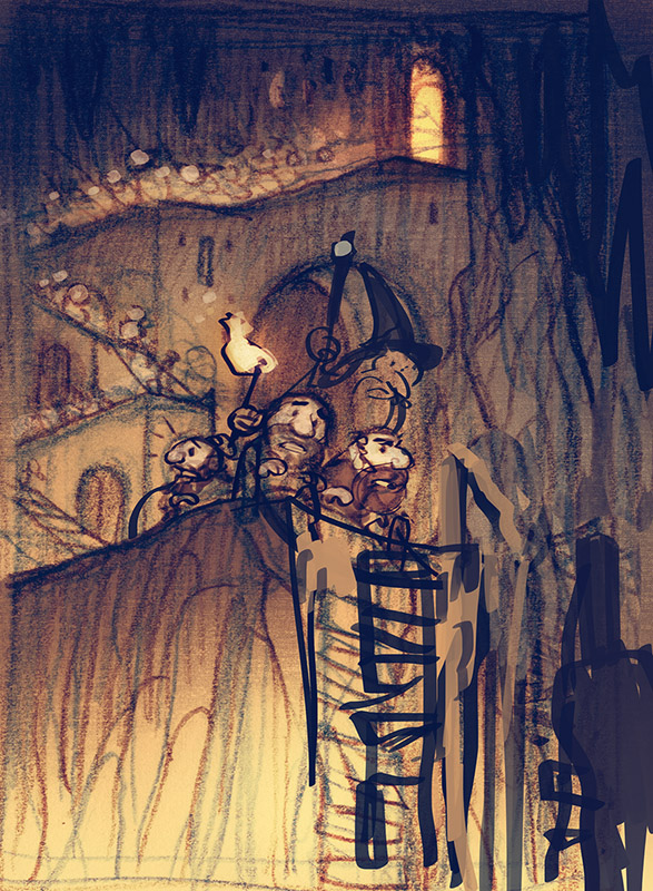
For all the scenes in this series, I am trying to arrange the scenes so that there is good real estate reserved on the canvas for both the character’s expressions, as well as the events they are reacting too. It’s an interesting challenge, trying to balance the need for a compelling environment, which tells a story in itself, and also give the characters enough space that the audience can readily understand who they are and what their story is.
For this one I did a quick sketch of all the figures in pencil, and then tried a few reworks over the composition in digital. When I had a basic arrangement that I liked, I did a tracing over this to see how it worked. If a character wasn’t reading well, I would cut them out and move them around, or lop off a head and try a new one there instead.

Eventually I ended up with a design for my characters that I was excited about. However, I was also very intimidated by it. I had a somewhat complex lighting arrangement planned for the scene. First, an overhead shaft of light from way up in the cave spotlighting the characters, then torchlight, and lastly, something glowing from below. (My children informed me that, based on their extensive Minecraft experience, it was certainly hot lava down there.)
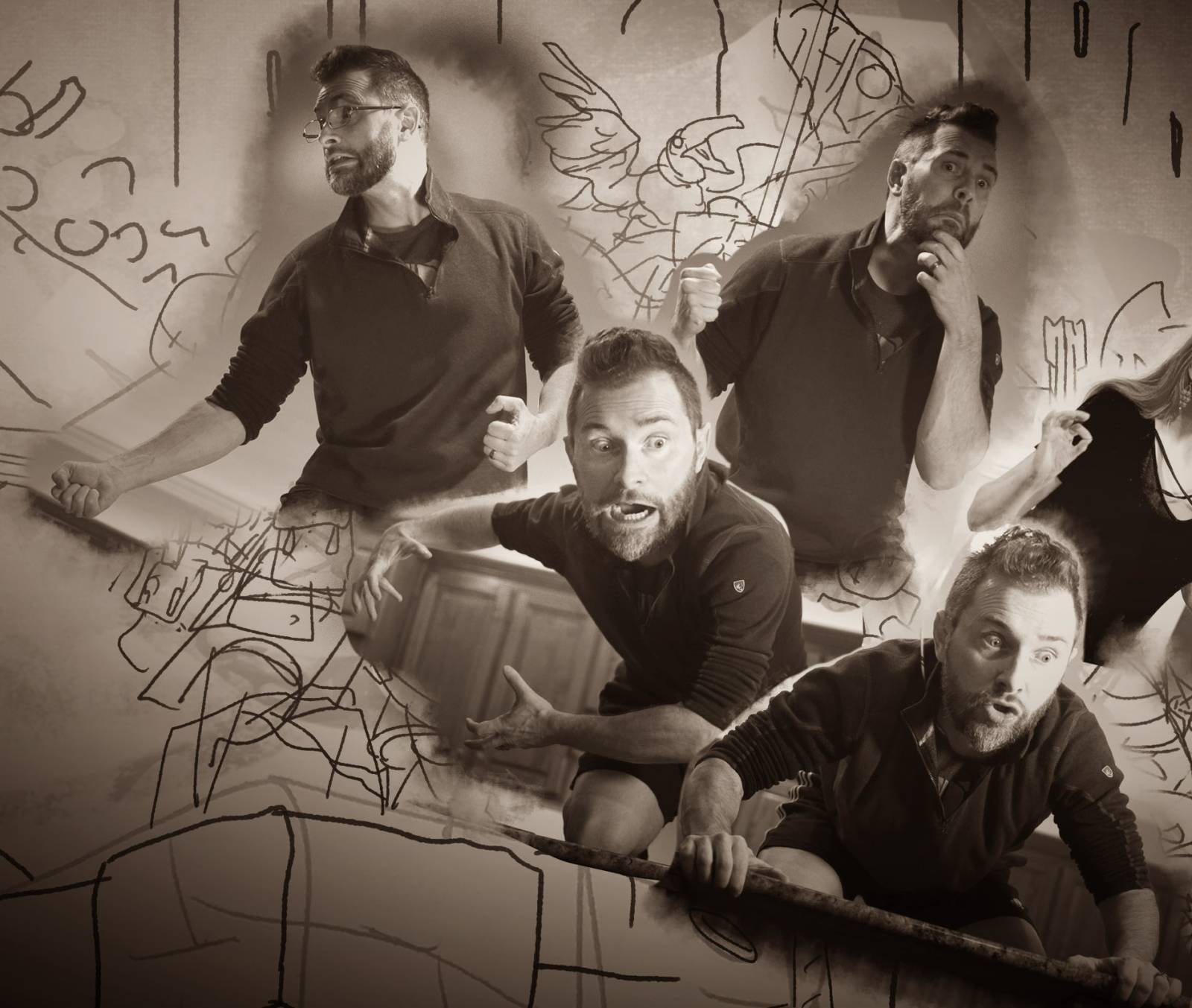
Anyway, I felt a little out of my depth with the lighting for so many figures, so I paid an absolute fortune to hire a group of Hollywood actors to fly out and pose for all the figures:
 Me IRL fleeing 2021, only to see 2022…
I’m kidding, I used myself. Why? Because I am terribly impatient and nothing beats the immediacy of handing someone a camera, hopping up on the kitchen table, and acting out your scene for the whole family. It also has the benefit of helping you better understand your characters as you try to become them. The photos are always embarrassing of course, but who cares? No one is actually going to see them but you! It’s not like I’m going to go posting them online or anything crazy like that.
Now, armed with my photo reference, I feel ready to take on any lighting problems I might encounter, and dive into the tight drawing.
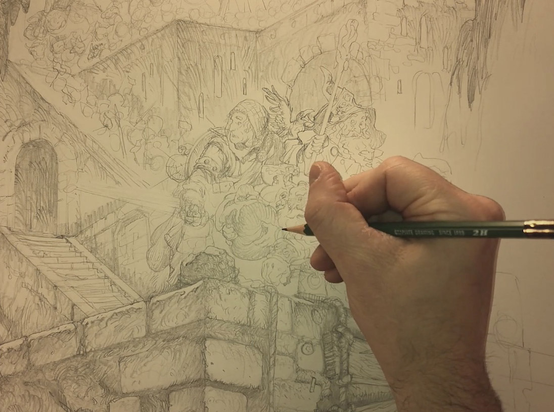
For the tight drawing I used a Kimberly’s 2H, (my all-time favorite graphite pencil) and a Staedtler 952 in 2B (my all-time favorite mechanical pencil). I am working on smooth Bristol. I like how easy smooth bristol is to erase and rework over. I also find that it stays very clean for big elaborate scenes where you don’t want a ton of graphite getting smeared all over. I trace out my scene first, and try to establish my shapes before I start worrying over shadows and textures. (It’s a lot easier to erase and rework a simple outline than it is a fully shaded and rendered area!)
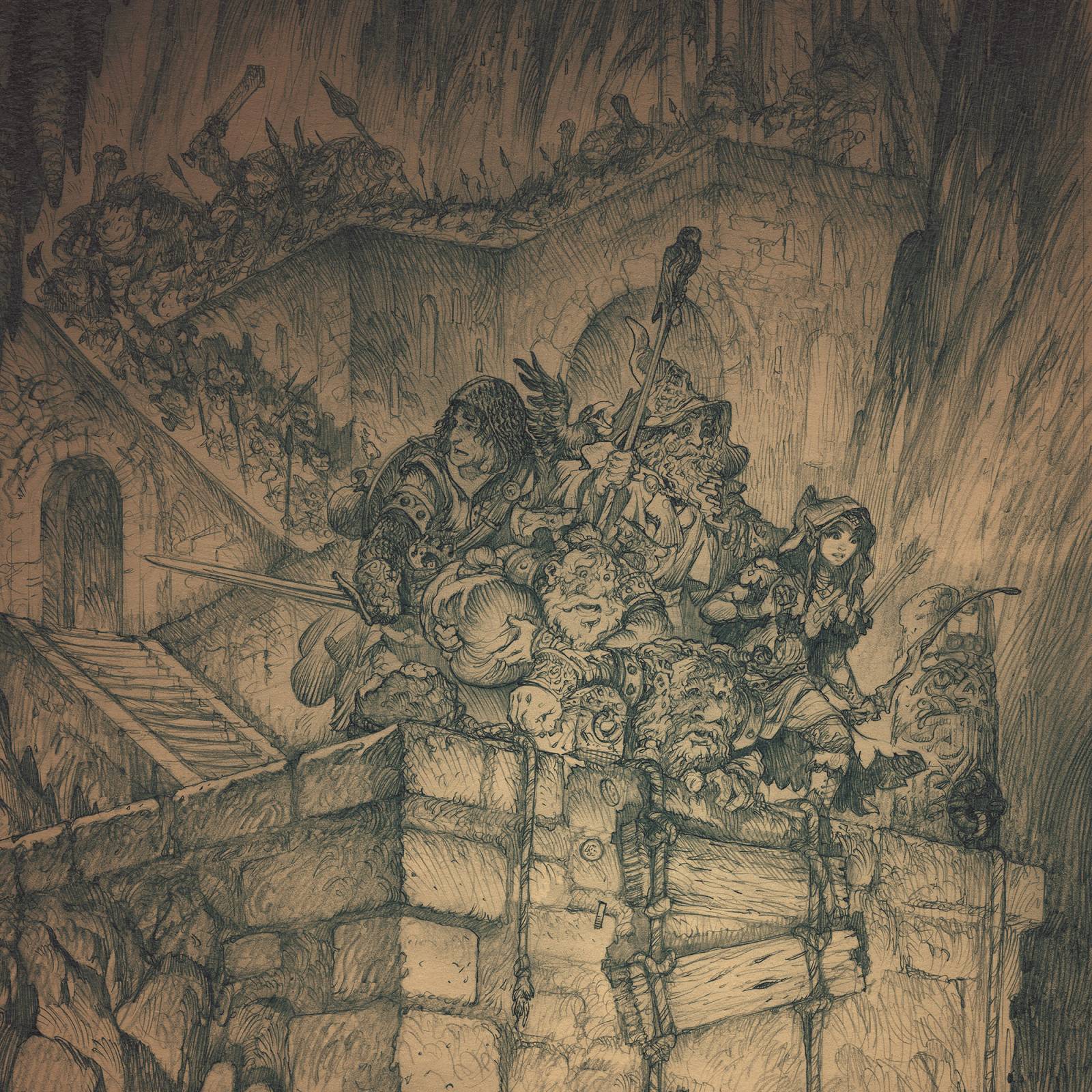
A few hours later and we have a nice, clean drawing of some figures in dire peril. (Fleeing 2021 only to see 2022? Let’s hope not.) Next we are on to the color! I will be finishing the color for this one live on Twitch every Wednesday at 10AM EST this month, so if you’d like to check it out, stop by tomorrow at twitch.tv/justingerardillustration
I will post details on the color process in my next post!
-jg

Fantastic! Seriously looking forward for this progressing to color. Thanks for this insightful and funny article.
I love it! Seeing your process is so helpful. Would you ever consider uploading your Twitch streams to Youtube?
For Tatsuya there was no escape from his nightmare and the only thing he will ever remember is the last time he saw his friends alive. He had watched in horror as they were torn apart by the bloodthirsty monsters that had appeared out of nowhere. In a panic, Tatsuya ran for his life as fast as he could but his body wouldn’t move faster than a snail crawling across the ground. And you can visit iif you want to sell your house fast. His legs felt like they were made out of lead while his heart pounded in his chest like an elephant stampeding through an open field.