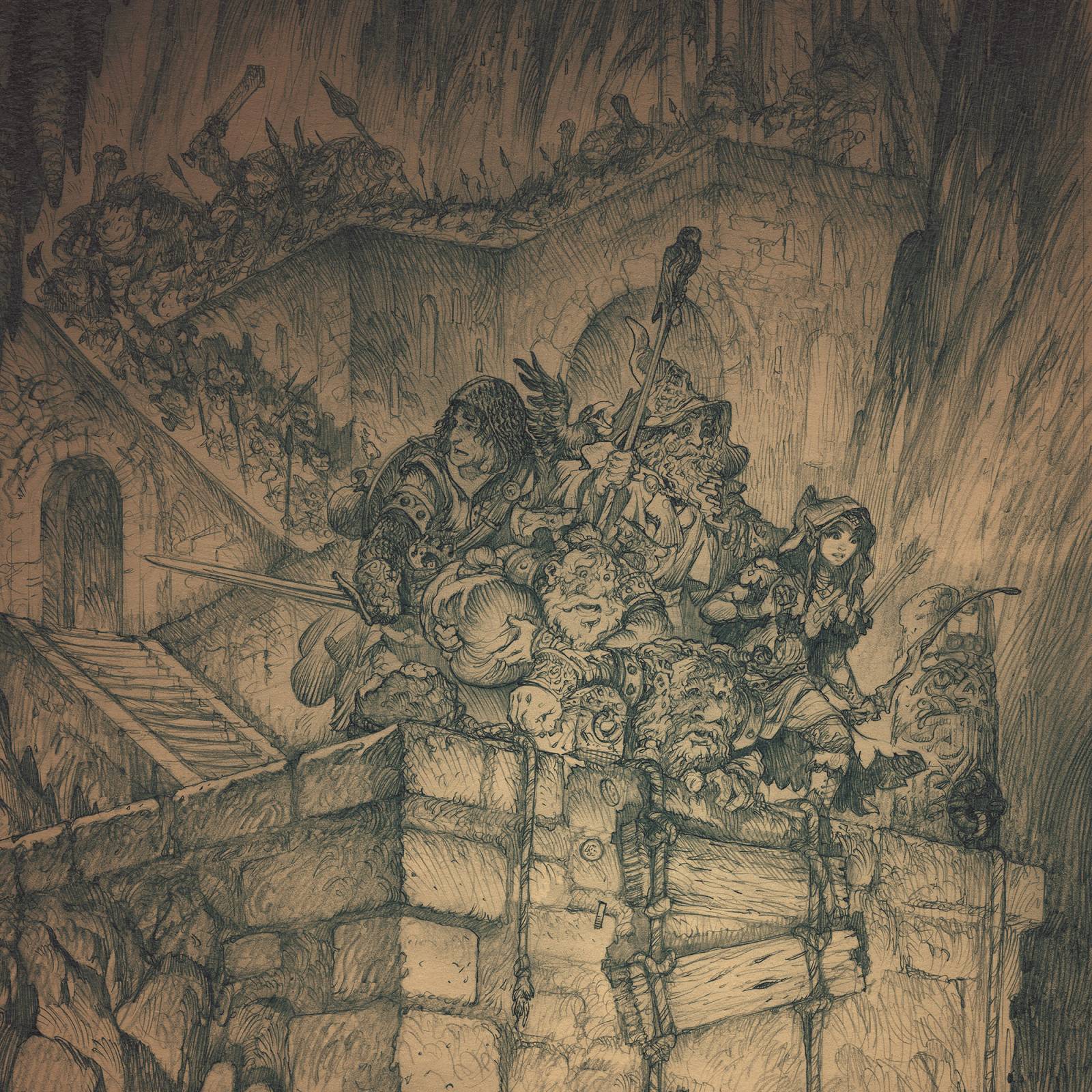
In the last post I shared the drawing process for a recent image called “The End of the Line” featuring some hapless dungeon explorers caught between a drop and a hard place.
Today I will share the process I used to take the image to final color using Photoshop. To start out, I had a small color comp:
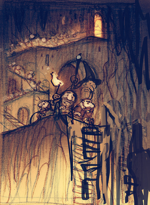
It’s less of a color comp, and more of a value comp with color temperature added in. But honestly, I feel that if I can understand these 2 elements clearly, then all the other colors will work themselves out as I go along. It isn’t a perfect color comp, but what it lacks in exactness, it makes up for in room for exploration.
To begin, I like to make sure that I refine and establish my value arrangement over the drawing. To do this, I just add a few layers of warm color using transparent multiply layers over my drawing. This quickly and effectively creates a monochrome underpainting with the drawing doing most of the heavy lifting.
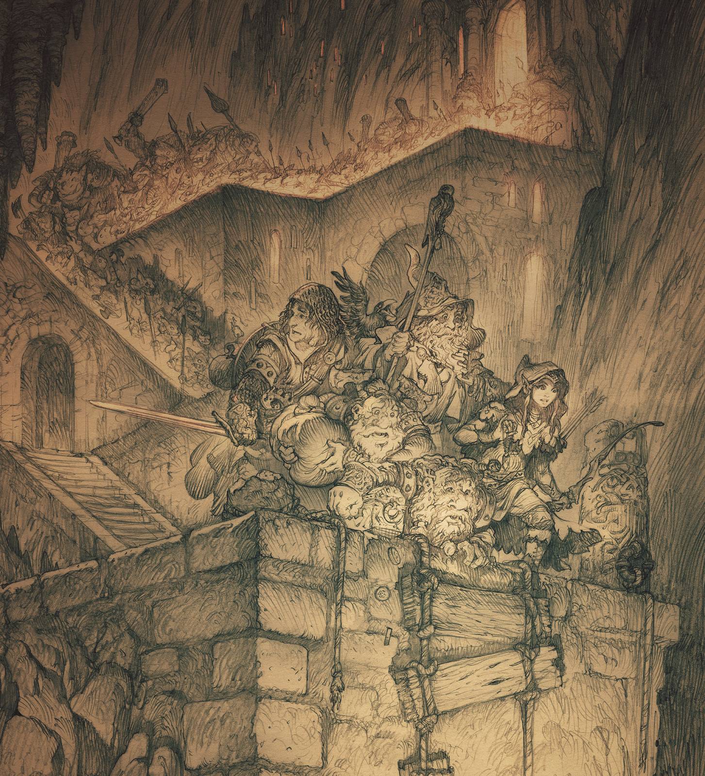
Next, I continue to use transparent multiply layers to layer in colors and explore the possibilities for the characters. I try a few palette choices for the characters, but in the end I stick with some tried and true fantasy classics.
At this point, we have established our design with the drawing, our values with the underpainting, and our colors with this last transparent wash. At this point, all that remains is to blend them together and render the image.
These early steps may seem tedious and overly laborious, but I believe they add a tremendous amount to the image. They add layers of detail, which makes the image richer and more interesting to look at, and also, help the image progress in a controlled and predictable way. This means less panic and screaming curses at the painting during the final pass. (Note that I didn’t say it meant “none“. I said less cursing and screaming…)
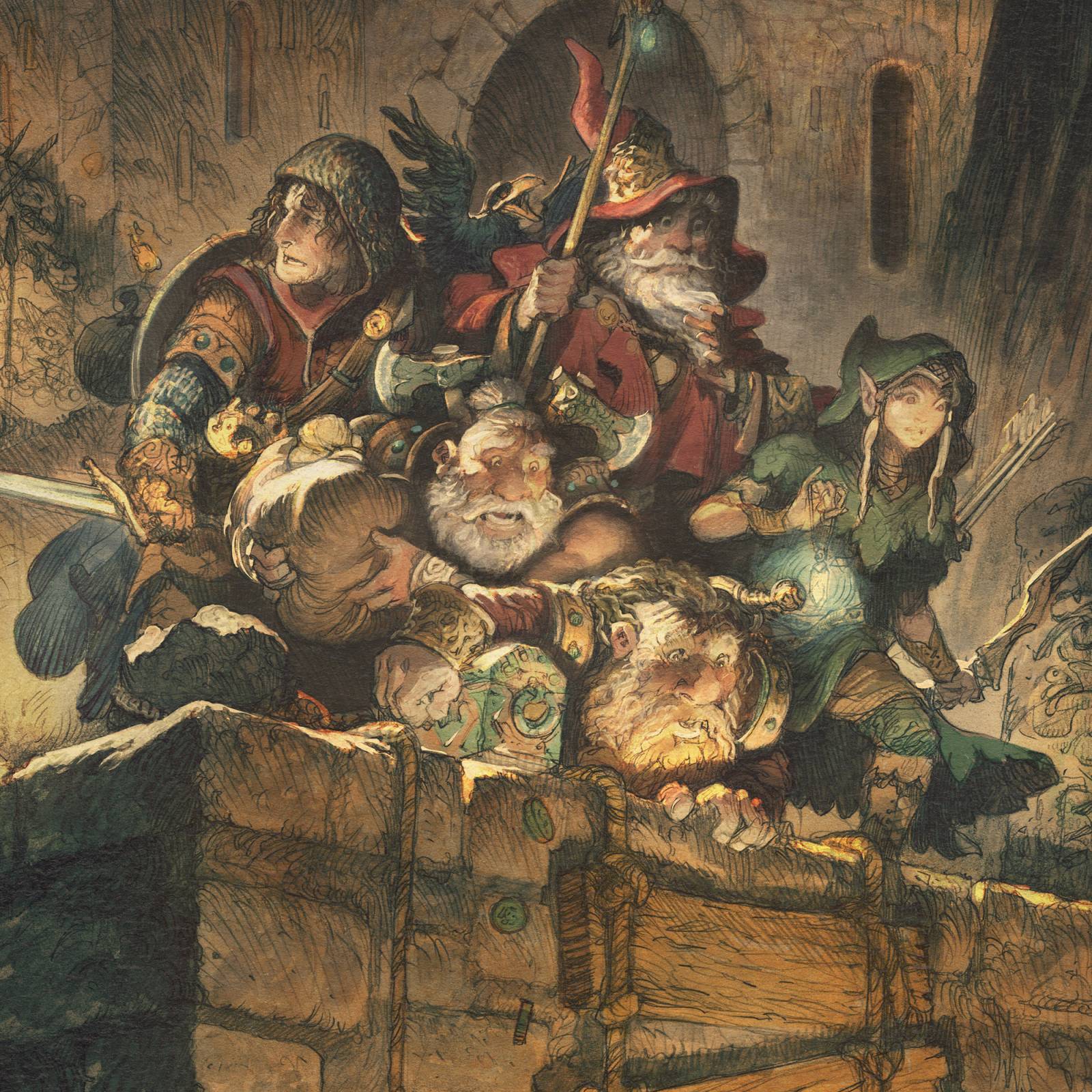
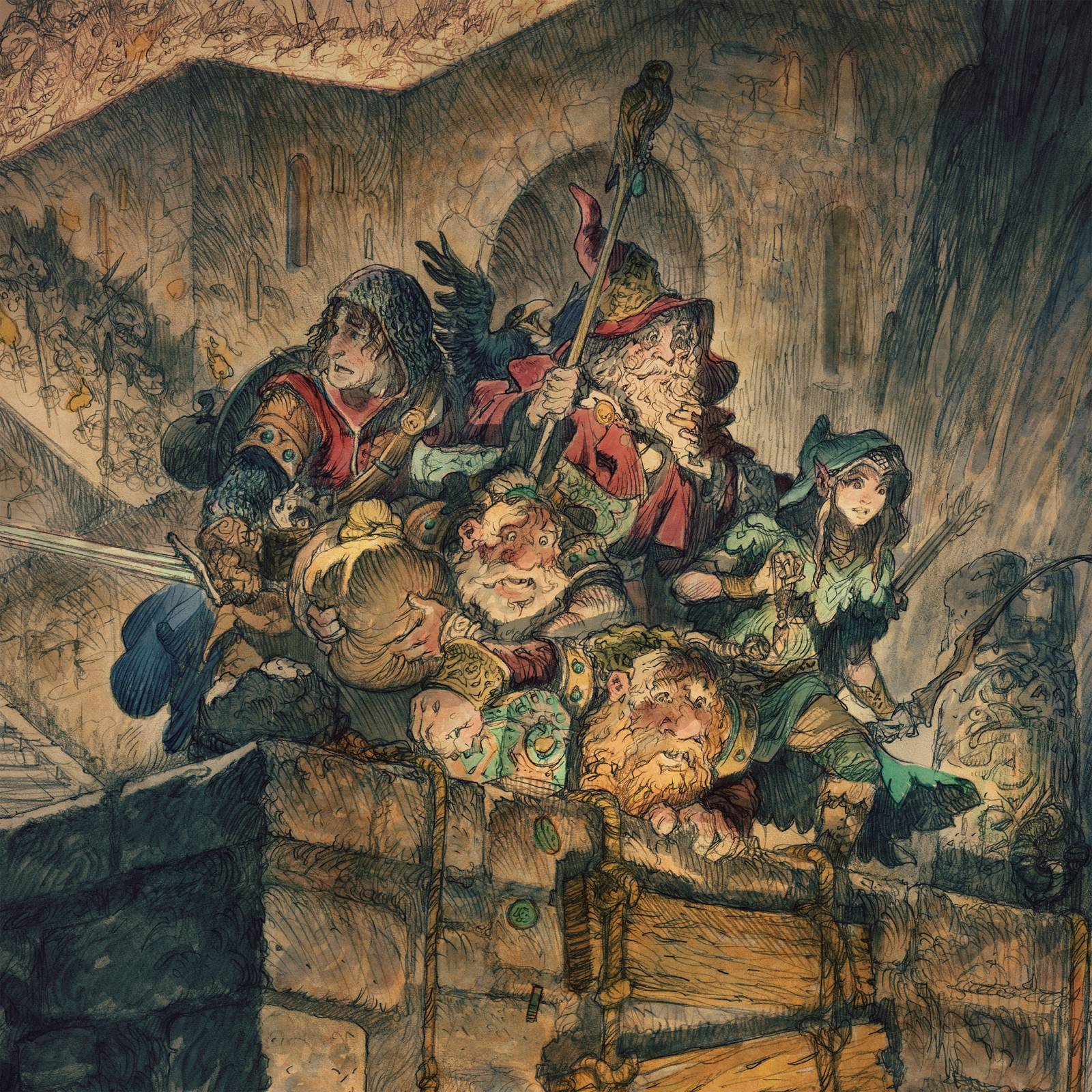
Now that the image has been established, I begin to render the shapes in greater detail. I begin with semi-opaque paint and use it to slowly build up, layer by layer, until the figures begin to take on a more realistic rendering. I try not to overdo it. We already established so much of what we needed to in the previous sections. It doesn’t need much and it would be easy to overwork it. Especially in sections that are more interesting than others.
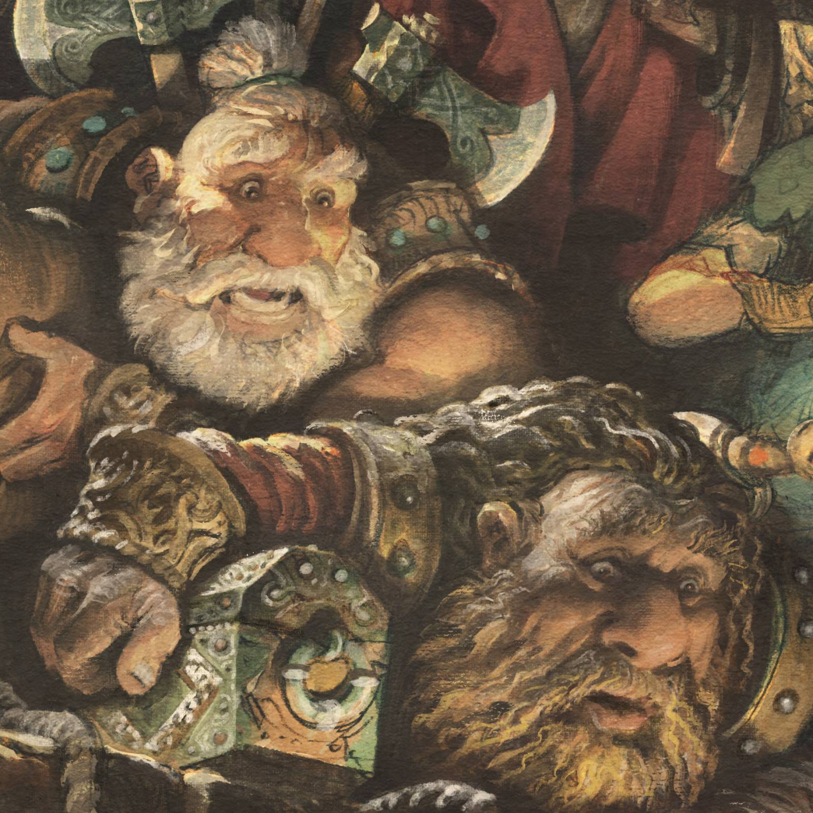
At this point, I make small changes to the expressions and details that have been annoying me up to this point. This is the main reason I don’t leave the image more like a transparent watercolor. I like the look of watercolor (a lot!), but I can’t help but start nit-picking the image at this point. I end up wanting to nudge things here, and change the shape of things there, and so on. Maybe add a an extra bit of armor over here? or an arrow? or give him fancy pantaloons? I love making drawings, but I hate being trapped by them. So at this point I start to make all of those little adjustments to enhance the narrative, correct proportions that have slid, and add further detail.
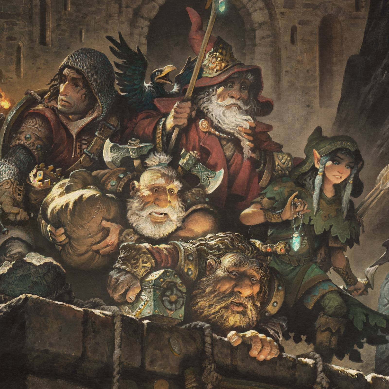
In the final stage, I start to play with the forbidden layer modes: Color Dodge and Hard Light. The ones that if you delve too deeply, and too greedily, you unlock horrors of the ancient digital art world. You know the ones: The burned out images, the highlights torched to a crisp. You must be very careful with these.
After some very cautious use of these, to enhance highlights and push up colors here and there, (and some mild cursing at the image) we are finished! I check my image against my drawing one last time to make sure I’m not forgetting some little bit of magic that perhaps I’d lost in the colorizing, and with that, we are done!
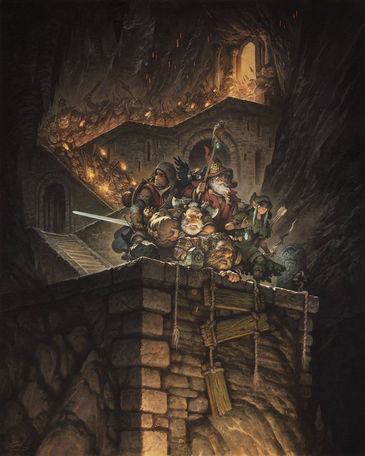
I hope you’ve enjoyed this one!


In my opinion this piece is one of your best paintings Justin. Nice storytelling in the artwork, as well as the article.
Some clever things going on for leading the eye! Cheeky!
The almost monochromatic color palette and grittiness is unusual to see in your work, but it works really well here, and your characters still have their “playful” (not overly serious) proportions and demeanor.
Great work! Thanks for sharing the process.