
Today I’d like to walk through my process of creating the Blood Token card for Magic the Gathering. This was the first physical oil painting I’d ever created for Magic, interestingly enough. I had a blast painting it and I’m excited to share these process photos with you!

The actual sketch I submitted to Magic
The first step was sending in the sketch to Magic. Some cards take a lot of brainstorming to create, others not so much. This was one of those times when I went with one of the first thumbnail ideas. The art director (Cynthia Sheppard) suggested adding petals somehow in the initial email and I’m so glad she did – they really lend to the set and provided an opportunity to repeat the red color throughout the image.
The sketch is a little on the rough side, but I wanted to get the lighting as accurate as possible, while still maintaining fluidity so I can give myself some flexibility later on in the process.
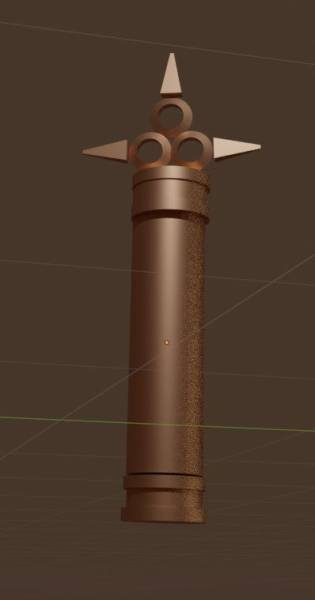
The model I created in Blender to help me with the reference.
Once the sketch was approved, I got to work on the reference phase. While I was waiting for some props I had ordered to arrive in the mail, I spent my time creating a (verrrry rough!) model of the vial in the program Blender. It helped me to get the perspective and lighting right, especially for the top part.
Circles and ellipses are especially important to get 100% right, they’re not something you can really freehand. If an ellipses looks off it becomes very distracting and obvious that you probably didn’t use reference 🙂
I highly suggest looking into Blender as a tool for creating random models as needed. It only takes a few videos before you’re able to create basic models, and it’s really helpful for situations like this.
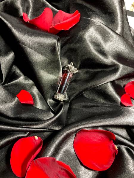
Reference photo I took from the props I ordered.
After setting up a mini photoshoot, here is one of the reference pics I decided to use. I bought a black silk pillowcase for the fabric, some roses for the petals (I chose to use real petals so I could get the subtle color shifts and velvety texture right), a couple little vials to choose from, and I even got fake halloween blood to fill the vial! It was really helpful so I didn’t have to guess what the blood would look like.
I don’t always buy super specific props for my illustrations, but when they don’t cost much and I can get them in time, I find that the time it saves is more than worth the expense.

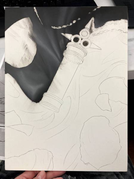
An additional reference photo. Notice I swapped out the silver vial for a new gold one.
I also used this reference photo for the gold lighting, the metallic finish (and how the highlights play off the gold surface), the chain, and the reflective light bouncing off the gold and onto the black silk fabric. I think this vial wasn’t technically waterproof so I couldn’t fill it up with the fake blood without it dripping everywhere, which is why I opted to fill the silver vial instead.
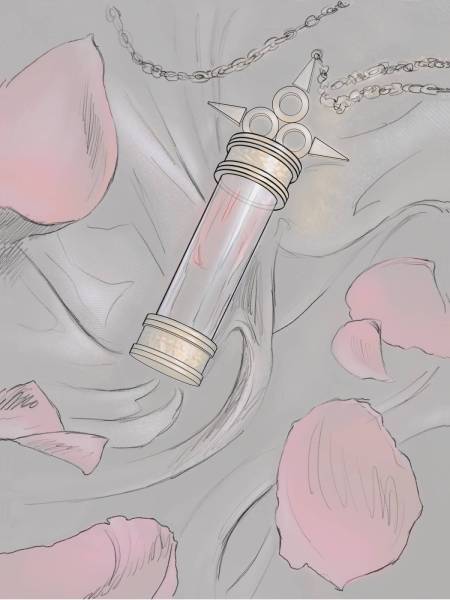
The final line drawing
After choosing and processing our reference photos, we arrive at final line drawing. I still ended up using the blender model as reference for the structure of the vial itself, even though I had a variety of reference photos I had personally taken, because I couldn’t seem to get the right angle I wanted, as well as the right design for the vial itself. The reference photos were still invaluable for getting the fabric, lighting, and metallic finishes right.
The time it takes to set up a thorough photoshoot and get the right reference is more than worth it!

The final comp
I painted the rest in photoshop, and created what I call the final comp. I tend to do a lot of my problem-solving during the entire painting process, so I find I actually save time solving those problems digitally before I go in with oils. Once the final comp is completed, the rest involves basically replicating the comp traditionally.
The bonus of painting a comp first is you can take it to finish easily if you run out of time with the physical painting and need to turn it in for the deadline.
I’m sure a lot of people would find this step unecessary, as I’m essentially painting two completed images, but since I am faster at digital painting and newer to traditional painting, it saves me a lot of time and energy I would otherwise waste trying to problem-solve halfway through an oil painting. Ctrl Z is a lot faster for me so I use it a lot!
Layer one (partially)!
Here is the first pass on layer one. Lately, I’ve been jumping straight in with oils. I used to make a layer with acrylics first as an underpainting, but I ended up getting so frustated with the acrylics drying too quickly and not blending properly. Maybe that will change as I get older, but for now this is what has been working for me!
First layer
Here is the first finished layer. I chose to paint the petals lighter during this layer, because I knew I would be glazing alizarin crimson over them, which would both deepen the underlying colors as well as lower the overall value of the petals (I think of glazing like the “soft light” or “multiply” adjustment layers in photoshop). You can see that I haven’t put in a lot of detail into the gold accents yet. I focus on the background and petals especially. I tend to paint background to foreground when possible.
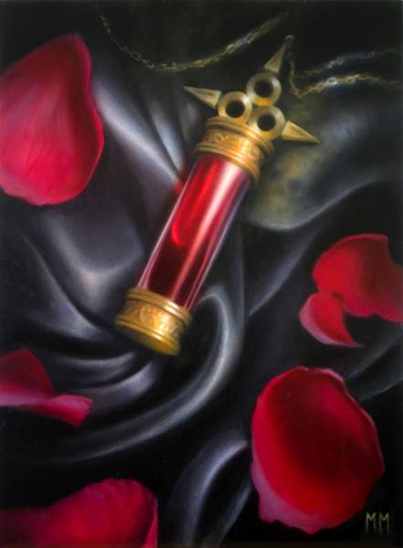
Final layer
And now we jump to the final layer! I wish I had more photos of the actual process in the middle, but I guess I forgot to take photos during that part.
It mostly includes glazing the transparent red oil paints over the petals and the blood in the vial, refining details, and finishing with adding the white highlights to the vial itself, as well as the fabric.
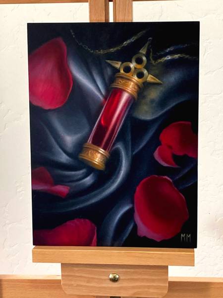
The final image
After all that work, we get to the final image sent to Magic! I upped the contrast and brightened it a bit so when the actual card gets printed, it is still legible from such a small size. I tend to brighten all my images before sending it in, since the cards almost always print a little darker than the submitted image (at least in my experience).

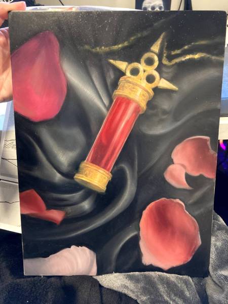
The final product (Excuse the signatures, I took this photo for my website)!
After about a year, the card gets released, and I get to share the image with you all! I was really happy with how this printed out, and that I got the composition where I wanted it.
And that’s about it! I hope you found this helpful or interesting, please don’t hesitate to ask questions down below!
– Miranda


Thanks for a great article!
The final printed token looks great in real life. Never noticed the skull reflected onto the fabric before, that is why having artists share their process can reveal often hidden elements. In the hobby of playing card games, it is mostly the art of the most sought after cards that get the most attention, but it is easy to forget that the artists creating the pieces used for “a simple token” put just as much effort into the work and have the same struggles (and victories!) as the others.
Thanks again for sharing your process!