When I was approached about doing this piece for Tor Books, the concept was relatively narrowed down. Essentially, the brief asked for a portrait of a woman covered in worms and noted some references to 70s and 80s horror posters. This was a strange crossroads for me as I feel very at home in horror and creepy art, I enjoy and was already familiar with most of the mood pieces sent, and I’m also really grossed out by bugs and worms. Mild phobia territory. I’ve managed to overcome this to some degree over the years, but photos and close contact with crawly things still give me a little bit of a panic.
So of course I was an enthusiastic “yes!” It doesn’t hurt to feel the horror a little bit to make a good piece.

My first step in a painting is always to get in the headspace and think out the idea a bit, and then do some pencil thumbnails. If it doesn’t comes at first, I might go back and forth between roughing out compositions and reflecting, always trying to find something exciting to jump off from. This brief was already so honed in though, I was mostly exploring different nuances and angles. I try to question my defaults as well, asking “what would it look like if her expression is muted? What about exaggerated? How much are the worms covering? What lighting will set the mood?” etc. All different what-ifs that explore how to make the image more potent. I can’t remember if it was at this point or a little later that I double checked with the art director: “are you SURE this is the image you want? It’s going to be intense.” And I was reassured, yes, this is the idea.
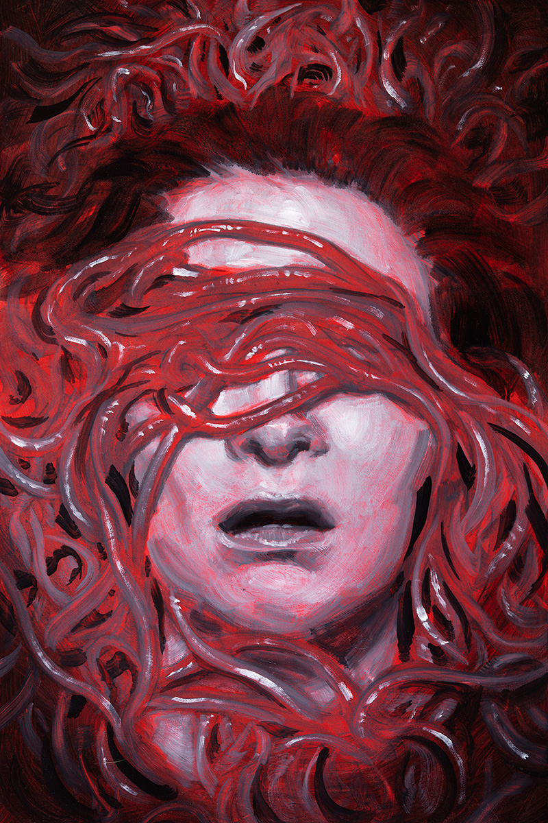
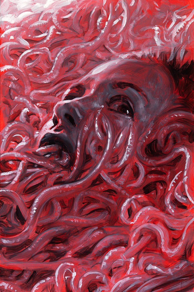
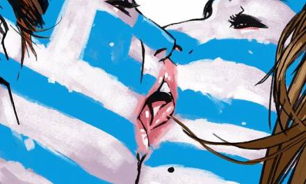
So I came up with three general compositions to present. The first two were very head-on. Confrontational. In one, the worms cover her eyes. In the other, her mouth. This allowed the full expression to be conveyed with only the parts of the face that were exposed, giving each a distinctly different feel. I wanted to try a few different lighting concepts as well, alternating between natural and something more like head on spotlight with the edges falling to darkness. The idea was to go for bold, stark, and suffocating. And then, questioning what I could do to take this further, I landed on a side view, slightly below, with the worms actually emerging from her mouth. Satisfied that these three ideas were strong, I began to shoot and gather reference.

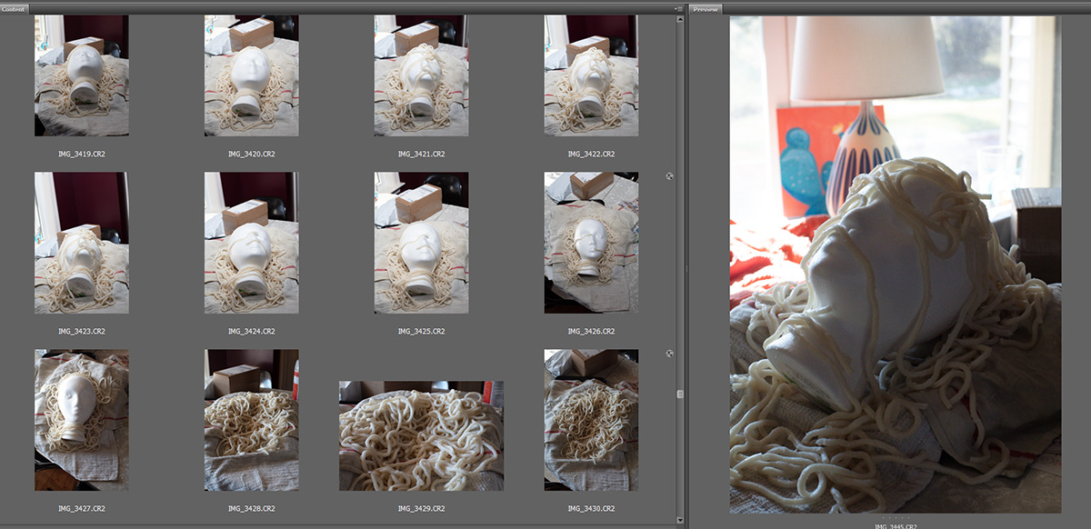
While I’ve lately been finding a lot of use for 3D in my referencing process, a real human model is essential for anything really emotive. In this case, I worked with someone who I have a long history with and had no doubts she could nail it in a few quick shots. That part of this equation was easy.
Then it came to the worms.
As it happened, I’d recently been learning to cook some dishes with Udon noodles. If there’s a noodle that is more worm like, I have not seen it. They are just the right thickness. They’re soft. When fresh out of the pot they have a shine. They even have a certain translucency that felt right. Though my model did say she was up for it, I didn’t feel it was necessary to drape wet starchy noodles all over her head. Instead, I subbed in a Styrofoam head and was able to work with the care and attention that I wouldn’t have if I were feeling awful about glopping this stuff on my friend’s face and hair. When later supplemented with photos of earthworms, this turned out to be an excellent source of visual information to pull the scene together.
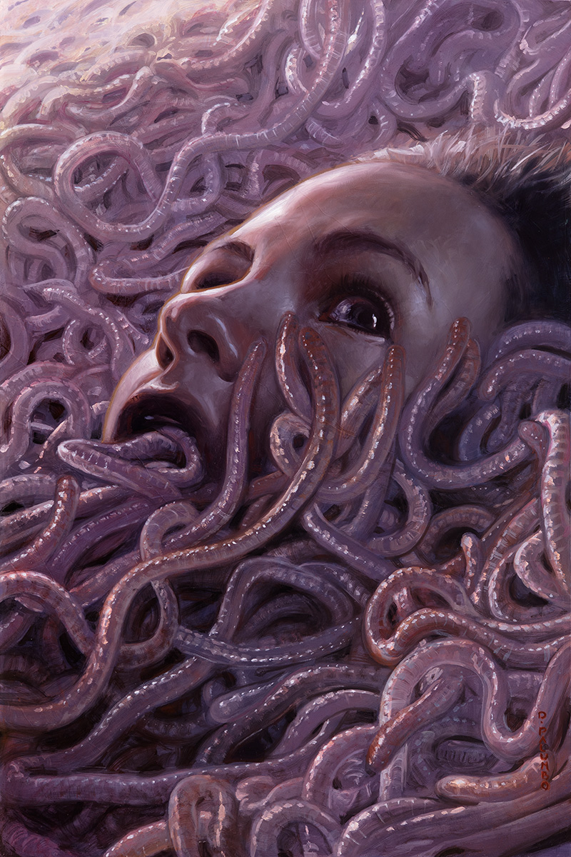
With everything shot, I then painted up the three ideas as value studies. These are what I ultimately sent to Tor to choose from for concept sketches. The choice was for #3. And I think this one does have a different quality than the others. It isn’t quite as boxed in, but the shift in perspective almost looks as though the worms are a wave overcoming her. That sense of drowning takes the idea of suffocation to a new level.

With a sketch approved, I projected the image into my full sized surface and drew in the basic shapes using oils. My first pass tends to happen in a series of very thin layers. Before anything, I tone the surface with a neutral midtone made from a mix of green and crimson. It tends to lean a bit purple. I then do my projection and place all of the shape information. When that is dry, I wash over everything with some general colors to start establishing the palette of the piece.
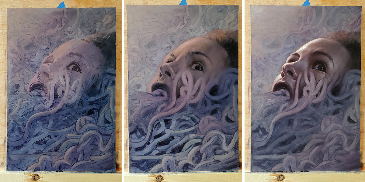
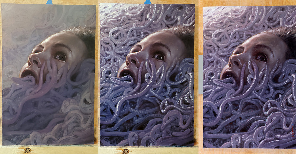
From there, I’ll start from a focal point and begin adding shadow, highlight, and color to build the volume. You can see that in some stages here.
I came to a point where I thought it was done, but wanted to come back in a day or two and have another look. On returning, I saw that there were still many areas that needed further refinement and that the overall piece was too cold, needing reds and pinks added globally to get the color mood that I really wanted.
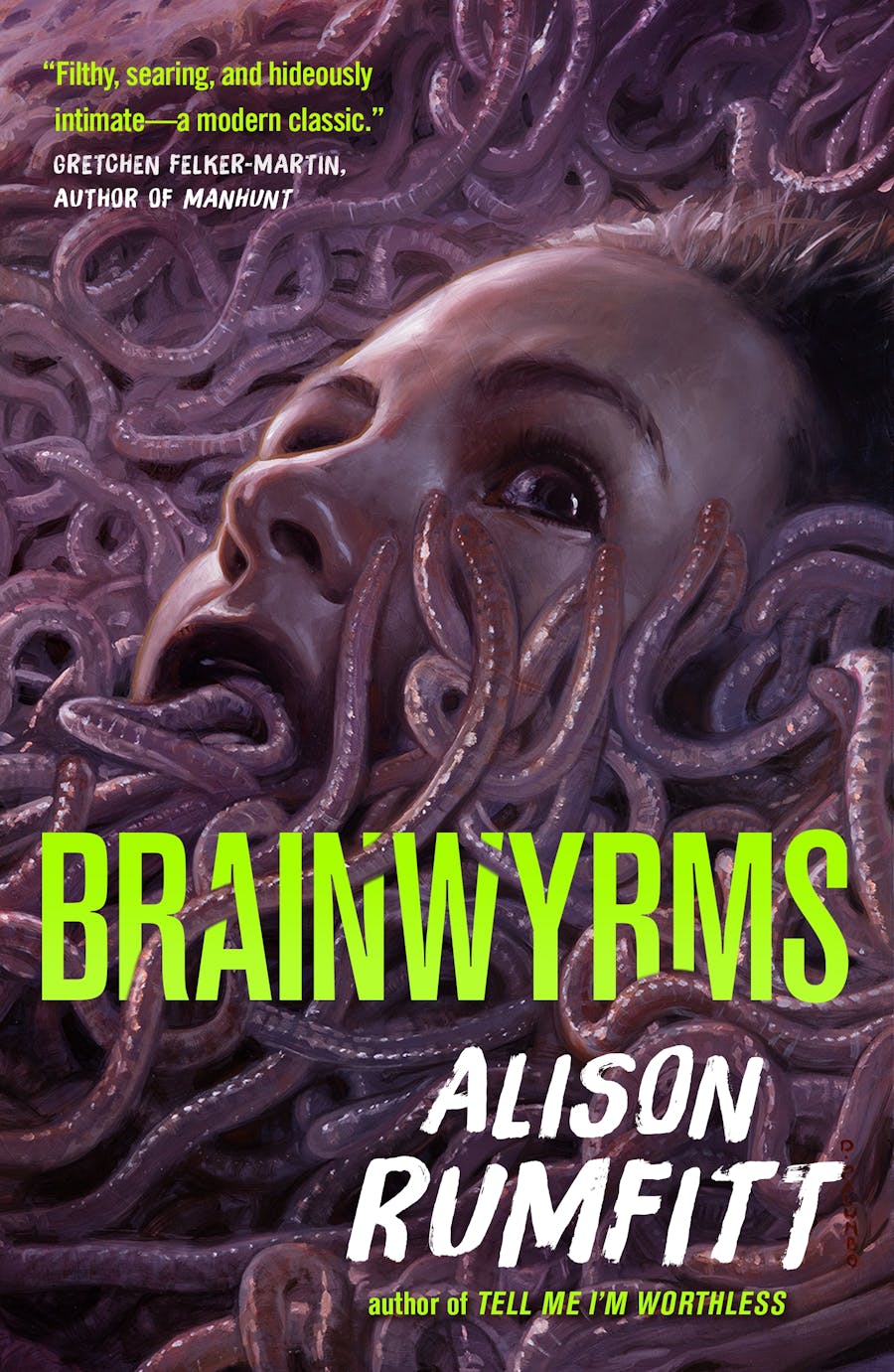
The piece was finally ready for delivery and, some time later, I was excited to see the final version with design added!
“Brainwyrms” by Alison Rumfitt. Art direction by Peter Lutjen. Keep an eye out for the book in October!

It’s great that such information is widely shared. I know that you put a lot of effort into making this article.