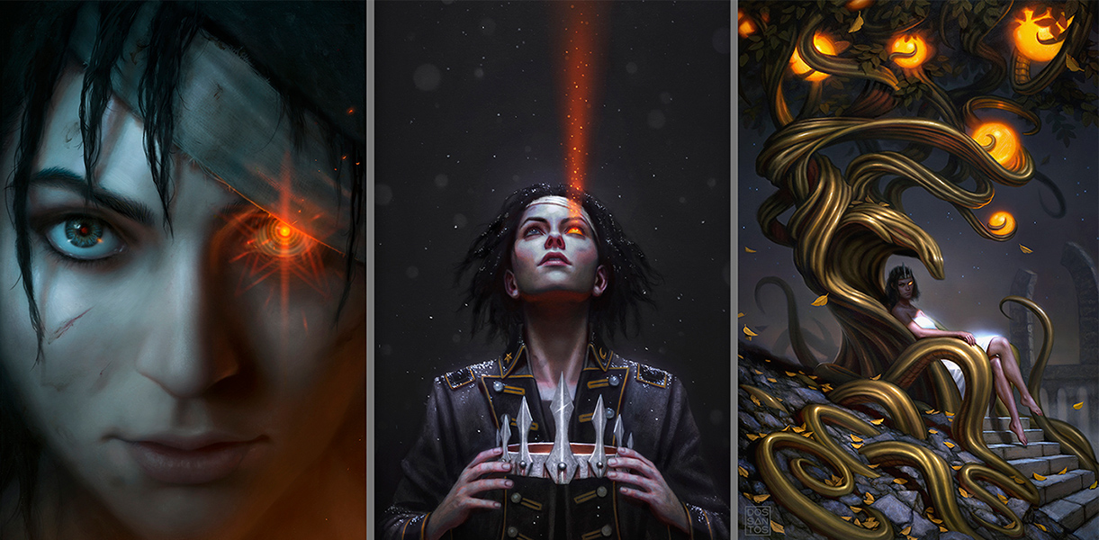
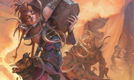
I was recently commissioned to create the 4th cover in D.J. Butler’s ‘Witchy War’ Series, ‘Serpent Daughter‘. The books are full of pagan magic, alternate American history, and Appalachian Folklore, creating a wonderful sense of gritty fantasy that really exudes a strong mood that I connect with. The previous three covers had been really fun to create, and already established a look for the series.
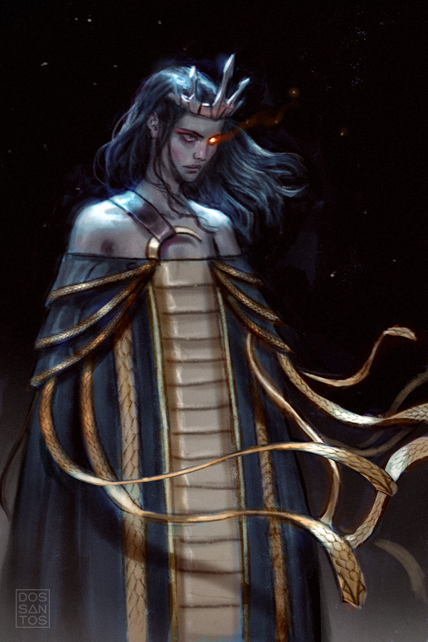
In this book, the protagonist, Sarah, has sat too long upon her throne. She has become incredibly powerful by becoming a vessel for her Serpent Goddess’ magic, but the prolonged use of that magic has begun rotting her from the inside. She is dying, and lines between Queen and Goddess are becoming blurred.
The previous three covers had gradually zoomed out with each image, and given the new arc, and the title, I thought it would be a good time to focus on the main character again. I wanted each sketch to focus on the main character, and her religious connection with the ‘Serpent’, in a symbolic, and literal sense. I wanted to elude to the toxicity of that relationship, and convey a strong sense of creepiness.
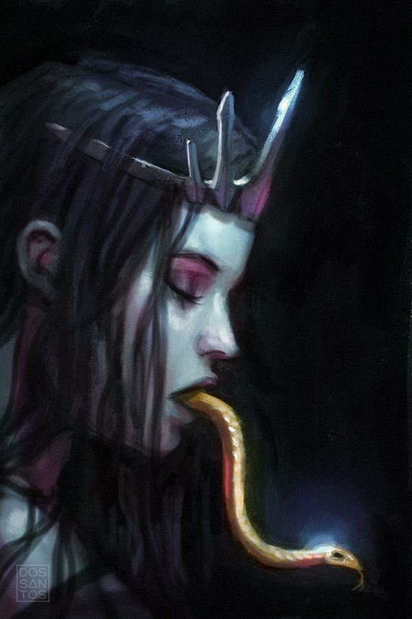
As is sometimes the case, these ideas came to me with strong colors already in mind, and were integral to the concept, so I executed the sketches in full color. There was something I enjoyed about each sketch, and would have been happy painting any of them, but the client opted for Sketch #2.
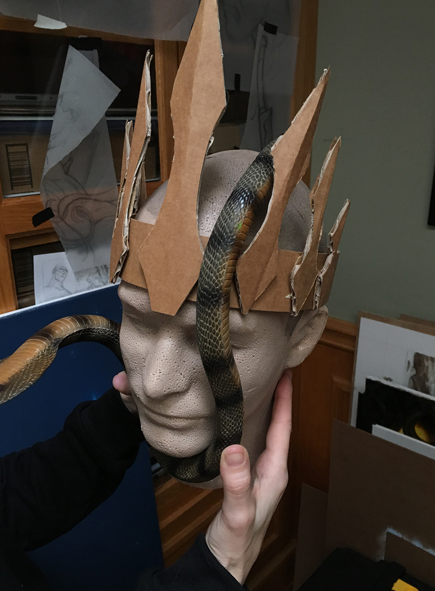
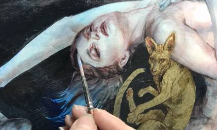
Once I had approval, I went about shooting some quick photo reference to help me polish up my concept. It’s a relatively simple image, so there wasn’t a lot to figure out other than some anatomy, and the specifics of the way the snake might actually coil against her face. I had previously made a cardboard crown for other covers in the series, so I still had that laying around. I put it on a mannequin head, along with a toy snake, and got all the information I needed to help refine the final image.
The biggest challenge was probably the snakes scales. Typically it’s a really bad idea to start painting every scale on a dragon or snake. It always looks over-rendered, and more times than not, hurts the sense of realism of the final image. But in this case, it was SO close to the viewer, that I felt like I really need to render it properly, for better or worse. To imply the majority of it would probably make the details of the face look out of place. There also isn’t a whole lot going on in this image, and often times, the simpler an image is, the longer people look as single items. So I felt like it really need some detail to hold the viewer’s attention.
Like I mentioned earlier, the sense of color was really import to me in this piece, and I wanted to create a sickly, almost Kerosine-type affect to colors I used. I felt like this would give it a sense of magic, and add some interest to otherwise simple piece. I’m a strong believer that light and color is sometimes all the ‘concept’ a piece needs.
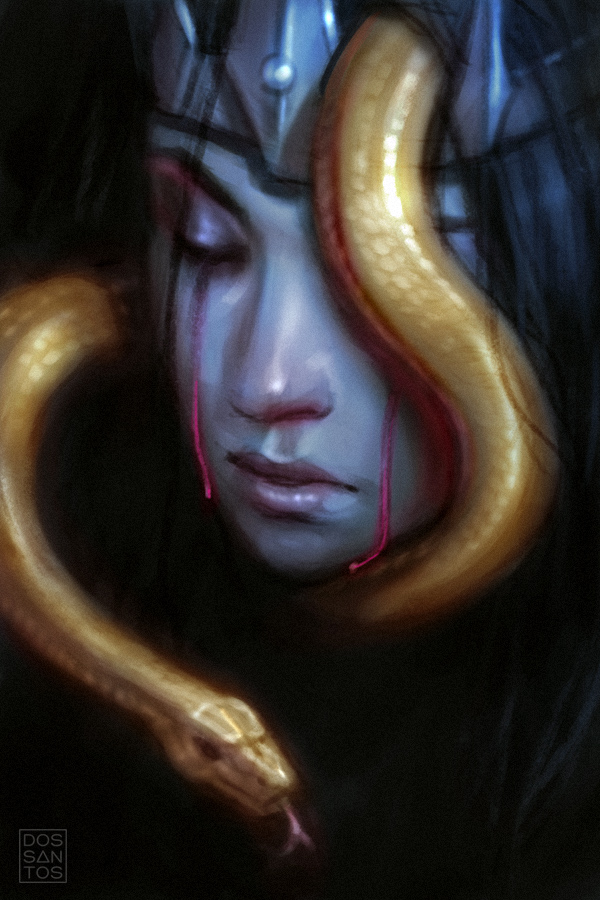
Below is the final painting that I submitted to the client.
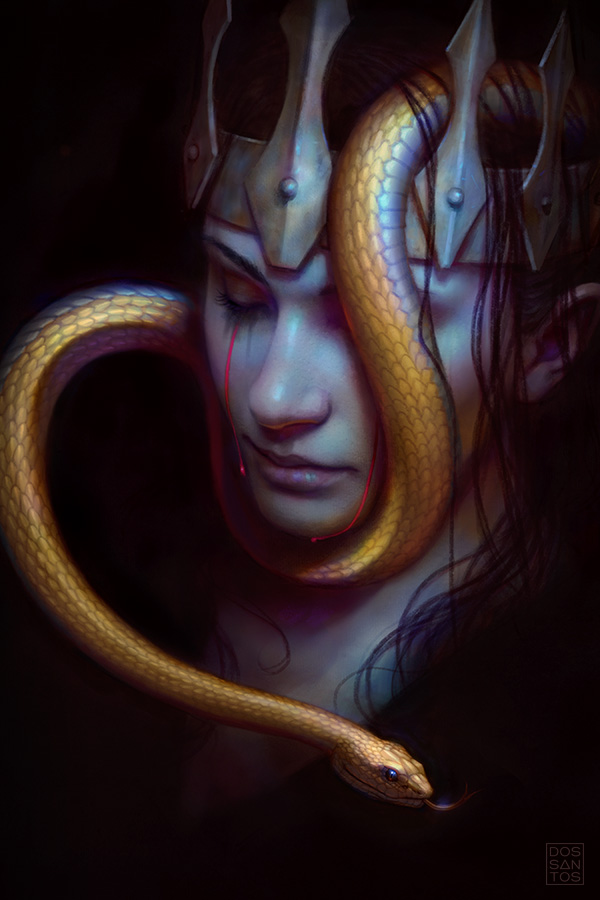
‘The Serpent’s Daughter’, by Dan dos Santos © 2019
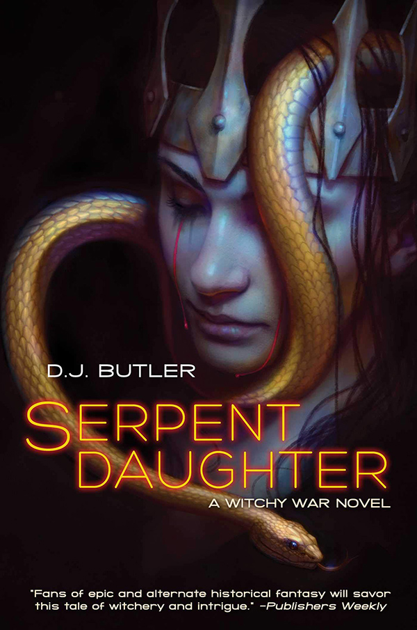
It was approved with no revisions, and appears as such on the final cover…
I hope you enjoyed looking at the process behind this painting, I certainly enjoyed creating it!


Awesomely creepy, Dan. Thank the gods they didn’t use the one with the snake coming out of her mouth.
Yeah, that sketch was a balancing act. I love the idea, but it went real phallic, REAL quick.
Truly gorgeous Dan
Approved with no revisions! Congratulations. That is always a great feeling.
I enjoyed you creating a model before you painted. I am left with wanting to know more about this daughter. Is that not the purpose of a cover? Awesome job!
I absolutely love this process piece. But I do have a question, will you go through your painting process on this one? I love the “vibration” the warm and cool moments give off in the skin. I would love to know how you attacked this piece to gain that effect.
Tim, This piece was done digitally. So the vivid colors are a result of blending modes, mostly ‘Color’ mode, with some ‘Soft Light’ Im sure.
I love the ethereal feel that the soft warms and cools bring. I was hoping it was done traditionally. I am going to have to really study it to see if I can adapt this with oils. Thanks!
Thanks for the detail explanation of your process. The cover came out really well.
You may have answered this before Dan, but do you typically read a good portion/all of the book when it comes to producing these pieces? Just enough to get the idea?
Turned out lovely!