The French have a word for it, that sense of time and place. It’s known as “terroir”, and technically speaking, connotes the special characteristics that the geography, geology, and climate of a certain location bestow upon the agricultural crops grown there. In particular, this is what the wine industry is all about, whether we are talking about an Australian shiraz or an Oregon reisling, and it is this, the unique backstories of each varietal, that sells the wine.
Fundamentally, terroir is the assumption that the land from which the grapes are grown imparts a unique quality, specific to that region. This is the story of the grape, unfolding like a James Michener novel, from the dawn of time, through human history, the whole fermentation process, and to the opening of the bottle itself.
In this day and age, wine labels are essential to the sale of a bottle of wine, and just like book jackets, they vie for our attention. They are graphically crafted to give an idea of that terroir in a visual sense, and to create a desire to experience living history.
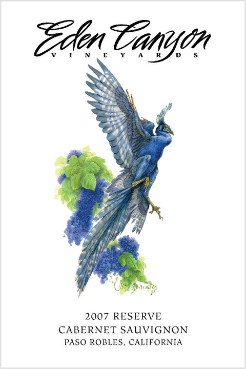
Eden Canyon Vineyards, located in the bucolic hills of Paso Robles, California, produces red wines such as cabernets, Pinot noirs, merlots, ports, and blends. The soils are comprised of infinitely ground minerals from the Jurassic Era, and these soils, combined with water and other natural organic material, are what give the wines a character that is different from the same varietals grown elsewhere.
My job was to come up with an image that was evocative of this ancient prehistory, and to be eye-catching, dynamic, and hopefully beautiful at the same time. Because peacocks freely roam the vineyards, I was reminded of dinosaurs, and then immediately of prehistoric birds, such as Archaeopteryx and Jeholornis. These ancient avians also lived during the Jurassic, and what if, somehow they survived in a pocket of time and place in what was to eventually become Eden Canyon? A special beautiful place, special beautiful birds, and hence, by implication, special exquisite wine.
Happily, the concept was accepted by Eden Canyon, and I got right to work.
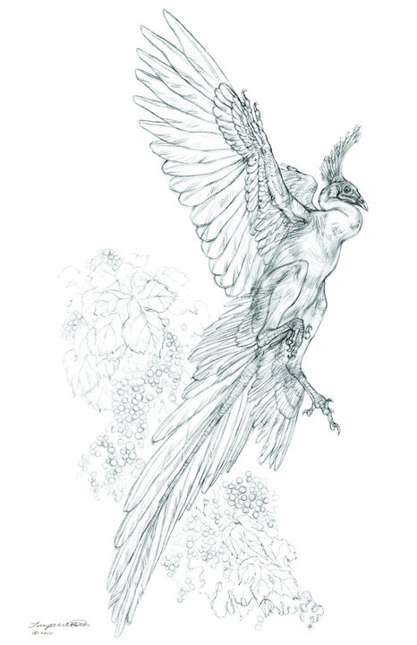
I began by doing basic research and anatomy studies from fossil records, as well as from real birds, and settled on the Jeholornis as the species to be represented. I drew it in a variety of flying poses, and presented the roughs to the client. While nowadays, grapes themselves are ironically portrayed less commonly on labels than in the past, the decision was made to include the grapes to give a sense of time and place for the Jeholornis to live in. Thus, in effect, a narrative illustration was to be created.
I spent many hours recreating the Jeholornis, anaylizing and re-anaylizing the structure of the wings, wing claws, and legs. While only distantly related to the peacocks mentioned earlier, they are very similar anatomically, which made a nice tie-in, so I gave the body an overall royal blue. The markings on the undersides of the wings and tails, however, came from peregrine falcons.

I also kept reference photos of the actual vineyards at my drawing board to keep my mind grounded in the ambience and spirit of the location.
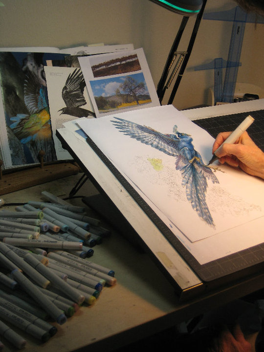
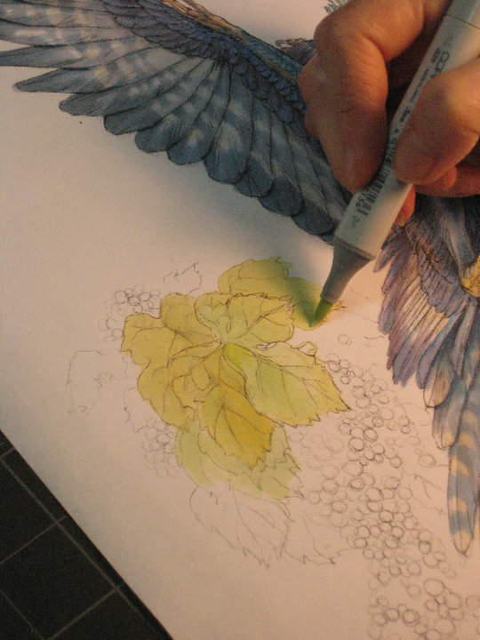
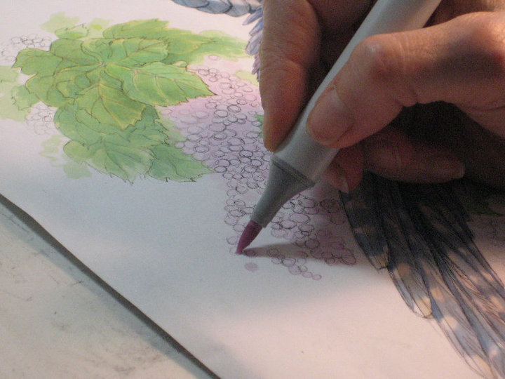
Both the bird and the grapes were painted using Copic Sketch Markers, to give a watercolor effect and also to be efficient with my time, as I had several other jobs pending during that period, as well as a class in Creature Design that I was teaching.

The painting was completed, and then integrated into the final design of the label. My sister is a very talented graphic designer, and put it all together, including the back label, and then, there was the foil collar color to be decided upon (gold!), paper choice, and of course, the bottle style, which was left up to Eden Canyon. There are distinct bottle shapes for each type of grape. Another interesting and very important aspect of wine labels is legal—the alcohol content fonts have to be a certain size by law, as least in the United States.
All in all, it was a great experience. I learned so much more about the wine industry than I had known before (despite the fact that my parents live in Calistoga, at the top of the Napa Valley). The wine was delicious, by the way, and sold very well, and the bottle itself proved to be a “keeper”, long after its contents had been enjoyed.
Again, illustration is about story, wonderment, and stretching oneself, in any context.
Innovation and taking chances in wine label design. An ancient bird selling wine. And, an evocative sense of rare, Jurassic terroir was the message in this bottle.

A thread for frenchies 🙂
Well, I don't know if californian Cabernet Sauvignon is better than french one, but its label is more beautiful for sure 🙂
I love the way you break down your process and what you do with copic markers is inspiring. Thanks for sharing!
Gorgeous work! I wish you had not mentioned the markers. They used to be my medium of choice in college, now I'm tempted to buy a set again!
Just gorgeous! Seeing the process and original pencil drawing is so great!
Beautiful Drawing, love the finished piece.
Fabulous work! Great to see the whole process happening before my very eyes…
I have enjoyed your work since I first saw it in Episode 1 art book. Your knowledge of animal anatomy and physiology is inspiring and shows beautifully in this piece. Capturing such elegance in a creature that can not be properly referenced is an immensely difficult task, one you pulled off with great success.