Welcome to Part 2 of Plundering Dragons! Part 1 featured Annie Stegg Gerard’s original oil painting Stolen Harvest. Click Here to read that.
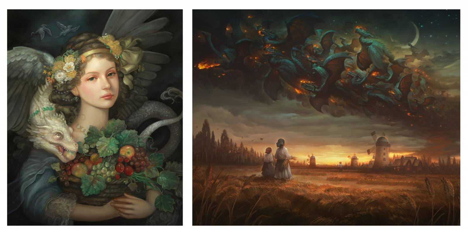
The Concept: Annie and I both did a painting on the theme of plundering dragons and worked on it without knowing or seeing what the other was doing for it. We wanted to see how we each would separately interpret the theme. The differences were interesting and we wanted to share the 2 versions with you here. In hers she went the direction of a very personal, romantic and human portrait, and in mine I ended up going the direction of a more ominous, foreboding landscape.
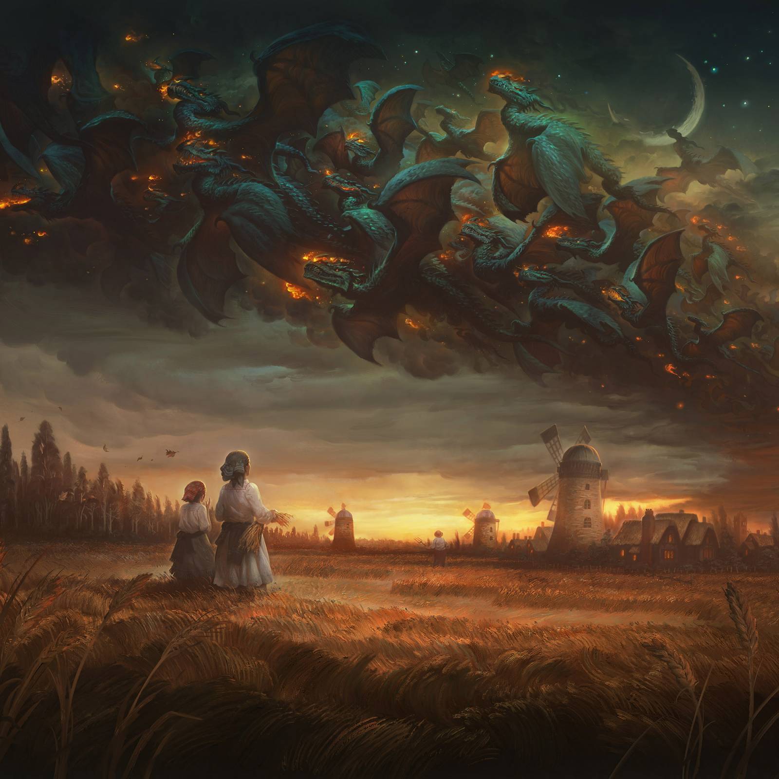
 For me, the image had a lot of meanings, but the most immediate was to do with tax season and that feeling of having worked all year to bring in a good harvest, and just when you’ve finally got everything stored up and stashed away…. a dragon comes to steal it all.
For Annie, the theme became a musing on the fleeting seasons of life and the endless cycle of birth, death and rebirth.
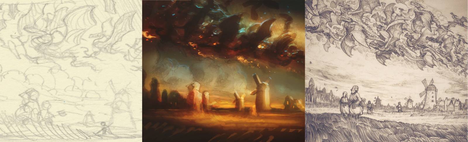
For the sketches and drawings I worked on Strathmore smooth bristol with mechanical pencils. For the color comp and the final artwork I used Photoshop.
In the following GIF animatic, you can see how the image developed as I worked. I always end up doing a lot of pushing and pulling in the chroma and values before arriving at the “correct” color. The early layers are mostly transparent modes (multiply, color dodge, and soft light) while the latter layers are mostly normal layers. Overall my files totaled several gigs and had about 500 layers because I simply cannot bring myself to manage my layers better.
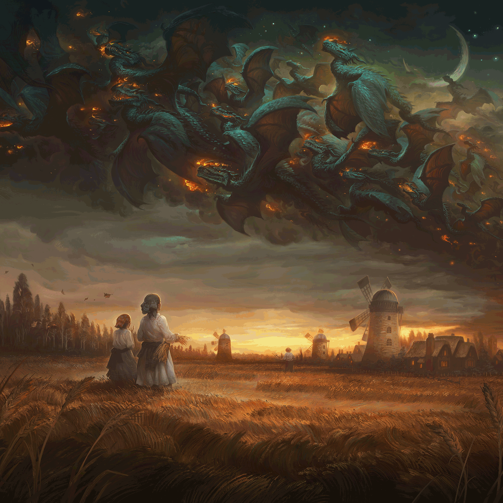
The Lighting and Color: Working in color has never come naturally to me the way that working in value has. Wether I am working traditionally or digitally, it is something I really have to wrestle with in every single painting. One shortcut I tend to take while finding my color scheme is to use color temperature as a starting point (instead of starting with local colors). I find this an excellent shortcut in general, but it tends to fail me a bit when I am presented with something like a late day sunset scene which tends to offer small variety in color temperatures and this can cause the overall color scheme to become flat and uninteresting.
To solve this issue here I lied about my light sources. Normally I would caution against using inconsistent light sources, but I believe that in fantasy imagery you have a little more room to operate. The audience may not forgive you if there is simply no consistent lighting in a scene, but they may forgive a single lapse or two if it seems to serve a narrative purpose. My narrative goal here was to give the image a dreamlike quality, as the scene was not meant to be a literal event, but rather an apocalyptic vision where the elements are all montaged one atop the other. The end results is something that may not be possible in reality, but that doesn’t matter, our minds can still make sense of it and hopefully find something rewarding in what is being communicated.
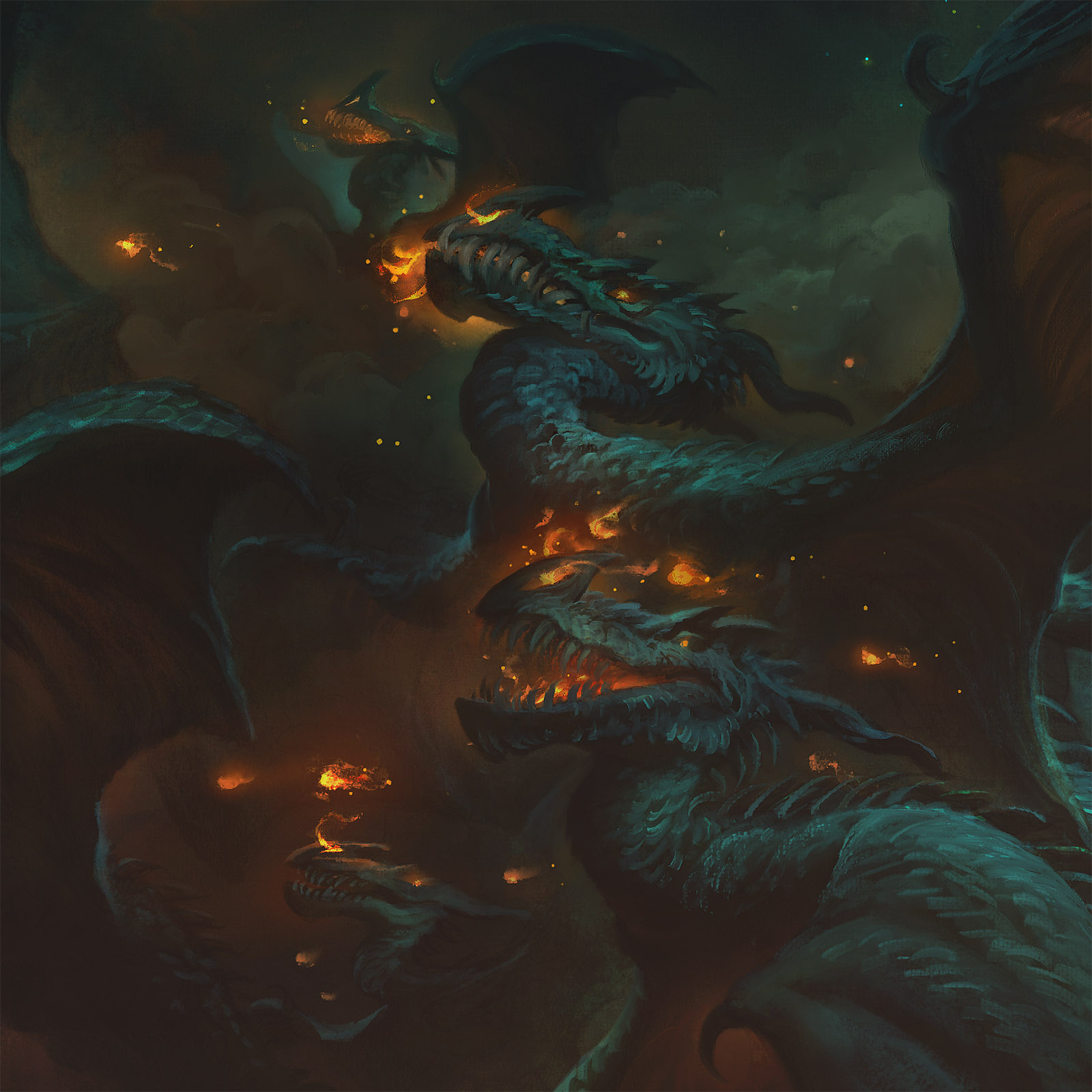
In the animatic you can see I started adding very warm colors overall and then later on added a green lighting to the night sky and a cold cast light to the dragons. This brought the image into better balance for me, and also had the added bonus of making the fire from their nostrils much more dramatic.
I hope you’ve enjoyed this series!
If you plan to attend Spectrum LIVE in Kansas City later this week, stop by and say hello! Annie and I will be at booth #1426!
Very cool Justin! Some great storytelling and mood. I love the idea of a swarm or flock of dragons.
This is one of the best pieces you’ve ever painted, Justin. Really captured that “storm a’brewin” kind of feeling. I can almost smell the brimstone in the air.
Hope SFAL is a good one!
This image is absolutely gorgeous. Thank you for sharing your process!
Ominous and foreboding is right! Methinks those windmills are being targetted as we speak. Terrific work Justin!
Outstanding! Thanks for such an insightful article.