I was recently commissioned by Lauren Panepinto of Orbit books to create the cover for the upcoming novel, ‘Son of the Storm’, by Suyi Davies Okungbowa.
Some clients come to me with no idea of what they want to see on the cover. They give me a manuscript, and just let me see where it takes me. Other clients already have very specific ideas in mind, and come to me because they know I, in particular, can achieve the solution they are going for. Orbit Books in my experience tends to be the latter. They take a lot time and care discussing options ahead of time, ensuring that they are keeping up with trends and capturing the right market for that specific author.
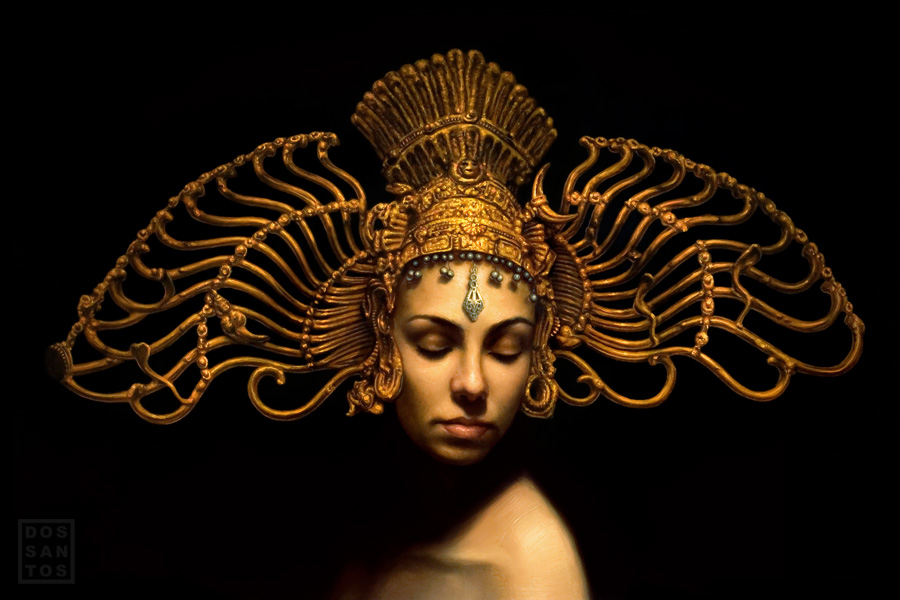
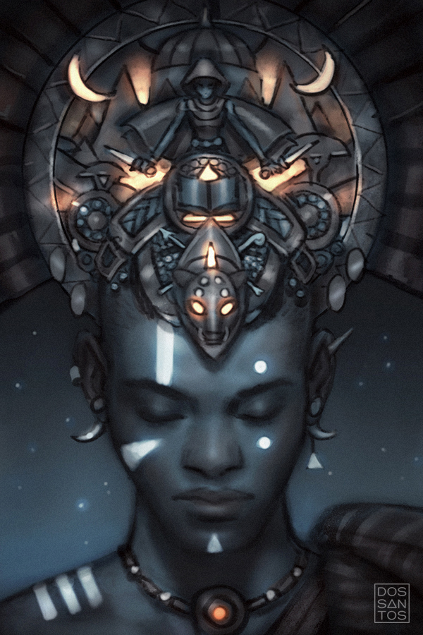
‘The Son of the Storm’ is written by a Nigerian author, and the Fantasy epic takes place in a world not too dissimilar to West Africa. Because of this, Orbit knew they wanted to capture a strong sense of ‘Afro-Fantasy’ (Consider it the genre equivalent of Afro-Futurism), if you will. They wanted to play up the distinctive tribal markings of the main character, and his unique, cultural garb. Because the story also has larger-world political themes as major narrative elements (ala Game of Thrones), they wanted to find a way to capture that sense of epic world-building, while not losing the focus of the main character. They thought perhaps a decorative mural, or headdress that eludes to the larger culture might do the trick, and also give the opportunity to add some gold tribal patterning that would make for striking cover. It was because of this decorative gold element aspect, and this portfolio image of mine exhibiting my experience painting such things, that landed me this job.
Like most jobs, the hardest part is taking all of the the clients suggestions, and trying to distill them into a single style of image that I feel encapsulates the overall ‘flavor’ they are going for, and really represents the book well, while still meeting all of the cleint’s needs. I started be doing a lot of visual research on different African cultures, looking for themes, props and textures I could utilize in my cover. Once I had a good feel for the general aesthetics of the culture, I sat down, and began painting my concept sketches.
I always sketch from imagination, so as not to get too bogged down with reference and accuracy. I usually start my sketches in greyscale, but because the gold was so important to the final image, I found myself concepting in colors. Often times, the colors were more important to me than the narrative of the sketch.
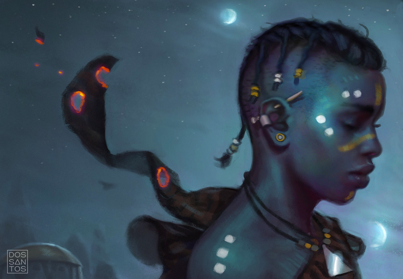
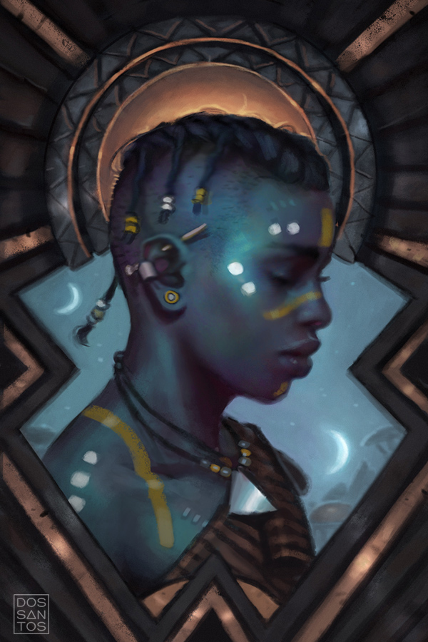
Below (and above) are a partial selection of some of the sketches I submitted to Orbit for their consideration. Typically I only do about 3 sketches for a cover, but because many of these were variations on a theme, I ended up producing a LOT more, about 13 or so.
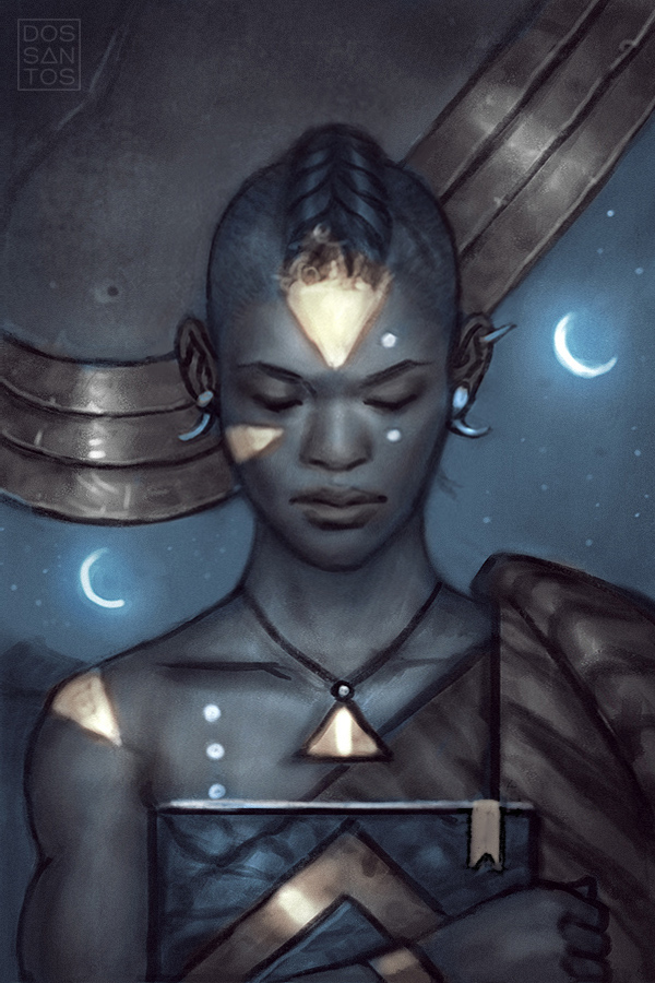
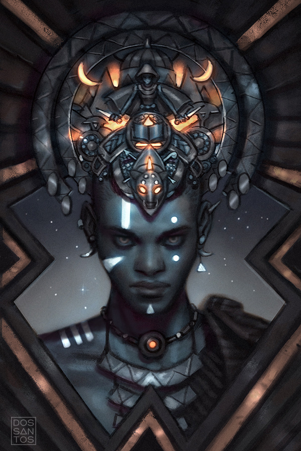
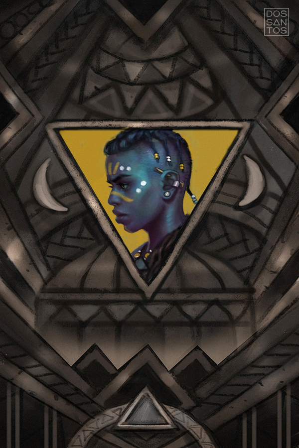
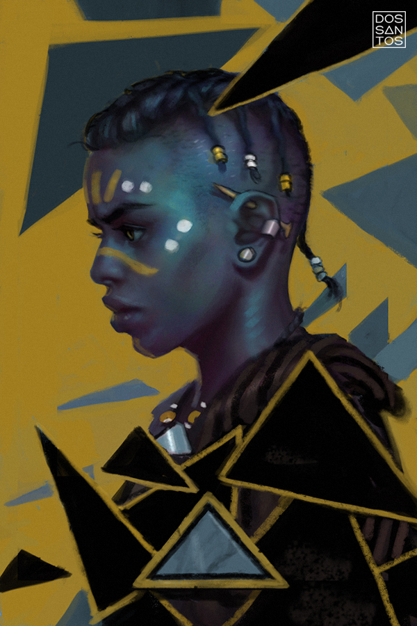
Lauren presented the sketches to her team, and they decided that we were on the right track, but wanted to mix the best elements from several different sketches. They wanted the decorative background of one image, but with different character styling, and also asked I have him making eye-contact with the viewer.

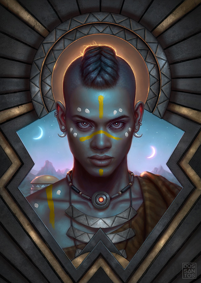
I quickly worked up a revised sketch the make sure I got the right look they were after. They approved the new concept with minimal critique, and then it was onto final!
Typically I end up doing an elaborate reference shoot to aid me in my final painting process. But because so much of this cover was decorative elements, the reference phase was incredibly easy. All I needed was some good head reference so that I could tweak my anatomy a bit, which was getting too stylized in my sketches, and wouldn’t translate to realism quite right without some modification.
Overall, this was a relatively simple execution. I worked digitally, painting directly over my sketch, so I was able to utilize a lot of the same elements and colors in my final art, polishing only what was necessary as I went along.
I handed in the final art, and Lauren had a few subtle critiques that were really easy fixes and made the final a lot better! You can see the final art below:
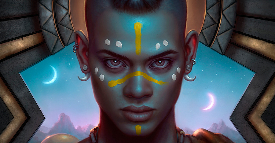
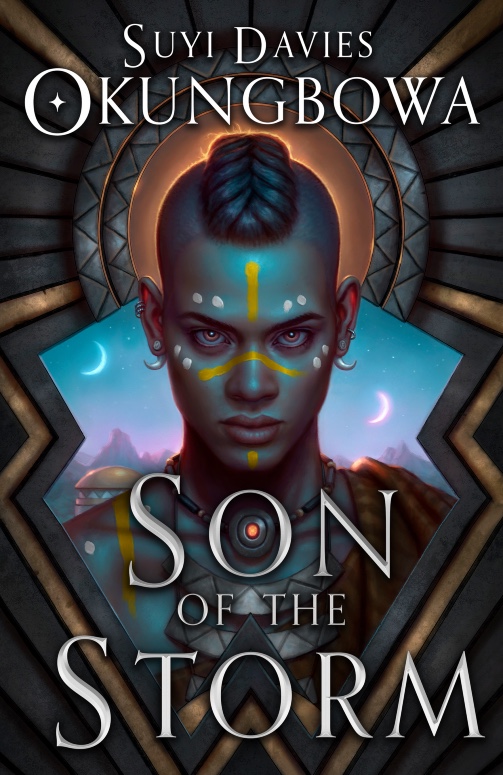
‘Son of the Storm’, by Dan dos Santos ©2020
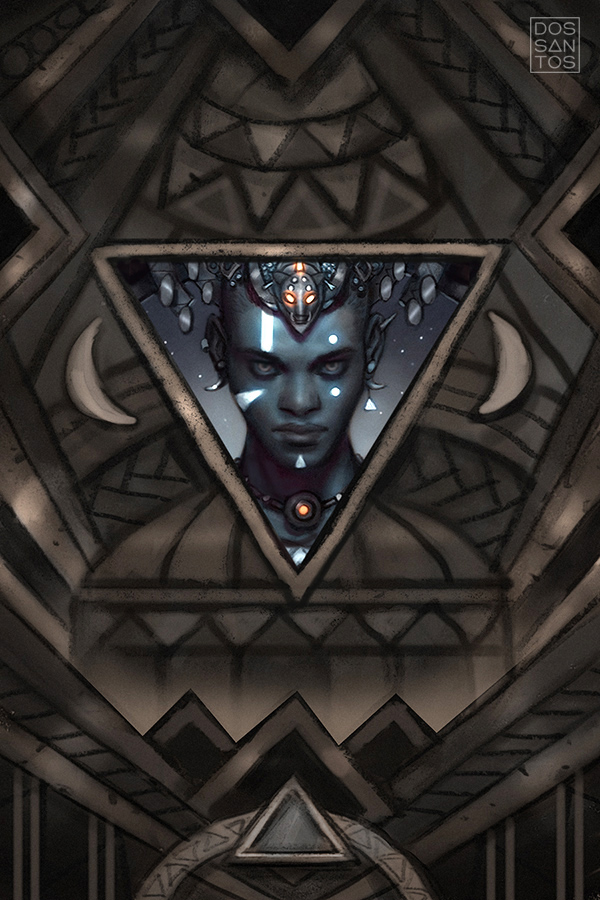
And lastly, here is how the final cover came out, with type treatment by Lauren Panepinto…
If you’re interested in this story, io9 recently did a feature on the book and cover art, and has posted an excerpt you can read right here:
https://io9.gizmodo.com/a-tense-traveler-awaits-a-crucial-meeting-in-this-first-1845220185
And for anyone interested in the art, prints are available right here: https://www.dandossantos.com/store/son-of-the-storm
And don’t forget to leave a comment on today’s post to be eligible to win a free video download!


13 + Variations really ?? Great Dan Dos Santos
Those are just what he is showing us 🙂
Seeing your initial sketches is often my favorite part of your process posts. It’s really interesting to see all the different ideas, as well how different my favorite often is from what the publisher chooses. Seeing 13 of them with solid color absolutely blows me away. It takes me a good day at least to get a rough sketch that I’m okay with.
Thank you for sharing your process for the cover,
it is been insightful to see it from the initial sketches through the final piece
I love the design, excellent harmony of color in general
I absolutely love the graphic tribal design approach! One more for the inspiration folder 🙂
all of these are so good Dan!
I absolutely LOVE seeing the way art work evolves. Sometimes with a purpose, sometimes by accident. Rarely does a piece end the way it begins. Great job.
Love the behind the scenes look! Thanks!
I’ve decided to make this my home page because normally I forget. So now I can keep abreast of these wonderful posts!
Afro-Fantasy? Love it! Black Panther blew my mind. Shakespearean.
Interesting approach, thanks
The red glow in the ears is an amazing touch to the portrait. They sort of give reason to the overall shading to the face. Wonder work and I can’t believe all the trouble you went to for the publishers. You are their eyes. I enjoyed attending the Fantastic Art Conference where you were one of the main presenters. You were an inspiration to me in working from the imagination. Anyway, congrats on a brilliant cover.
Lots an awful lot of preliminary sketches, all of which are better than any finish I could do. Fantastic work as usual.
Loved your process. Thanks for sharing this with the world. <3
Nice teachings from the mighty Dan Dos Santos! 8)
incredible as always! I love how even though you used such strong, bold, shapes they don’t dominate the piece but somehow enhance the impact of the portrait instead. That is not easy to accomplish! Thanks for sharing your process!
Congrats! You’ve won a FREE VIDEO. Please check your email for details.
Such a beautiful color harmony – – I’m so intrigued by the color palette on this painting.
Really love these. The deep blue with the gold pops so nice. And omg – 13 options?! Lol I always edit my options down even when I produce a lot to the top 3-4. That way the people viewing it don’t get stuck in indecision.
I like how it still has a night quality to it but the end result is much brighter.
Love the final result. And thanks a lot to share your process. Realy intersting like each article each day on MC !!
these processes are so insightful, and your work is so beautiful as usual, thank for sharing these Dan!
Great work! Any particular reason why you went digital on this one?
Fantastic! I love the subtle use of blue for the highlights.
Thanks for sharing!! Your sketches look like finished work 🙂
Thank you for sharing. The Muddy Colors contributors have been putting out some of the best art related content available. Even for artists not working in the scifi/fantasy field. Thanks for that as well!
Thanks guys for you daily post. It eases my morning every day 🙂
Really cool to see the various versions and the final result (:
Love the result!
Really digging how the colors came together in this one, Dan. That sky with the decorative elements is an awesome contrast.
Your process is very specific. I find it so difficult :V.
It’s total mastery, kind of reminds me of painting like the flemish painters.
I love seeing how the process works for creating a masterpiece and meeting the client’s needs. Thanks for sharing it. I’m finding success using some of the same methods.
As always, your process is inspiring, Dan. I loved seeing the quantity of concepts you created, because each in its own way is a solid illustration, though obviously the client made a perfect choice for the final. Well done on all counts, Sir!
Love your use of green for the highlight color. Beautiful painting,
Really great work Dan, this is definitely one of my favorite portrait pieces from you. The colors and detail work is particularly impressive. Always great to see your process as well, thanks for sharing!
I love seeing this whole process. Thirteen is a lot of drafts to do, but the final is amazing.
That was fascinating – thanks for sharing!