When I was in art school we were given an assignment to draw on sheets of brown paper using only white chalk and charcoal. I’m talking like cheap-ass grocery bags, burned sticks of wood, and chunks of the Dover coast. I had no idea what the point was. Now I do.
This was back before plastic grocery bags were invented… which were later made illegal, so we’d switch to reusable (great!), which then became illegal due to the plague (oy), which brings us back to paper bags (yay?) as the only option right now, which means I have a mile high stack of them in my closet. Point is, this is a great time to get toned—so go to the grocery store and buy a bunch of vegetables, whole grains and lean proteins, then use the bags to explore the wonders of working on a toned ground.
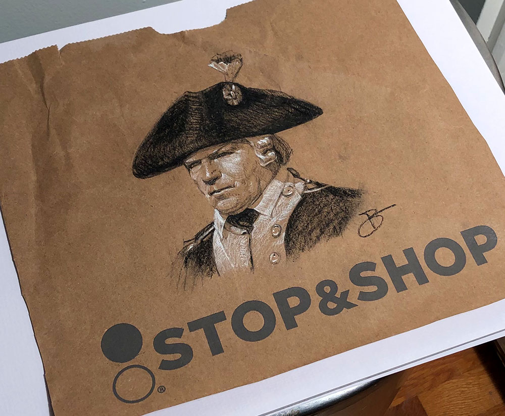
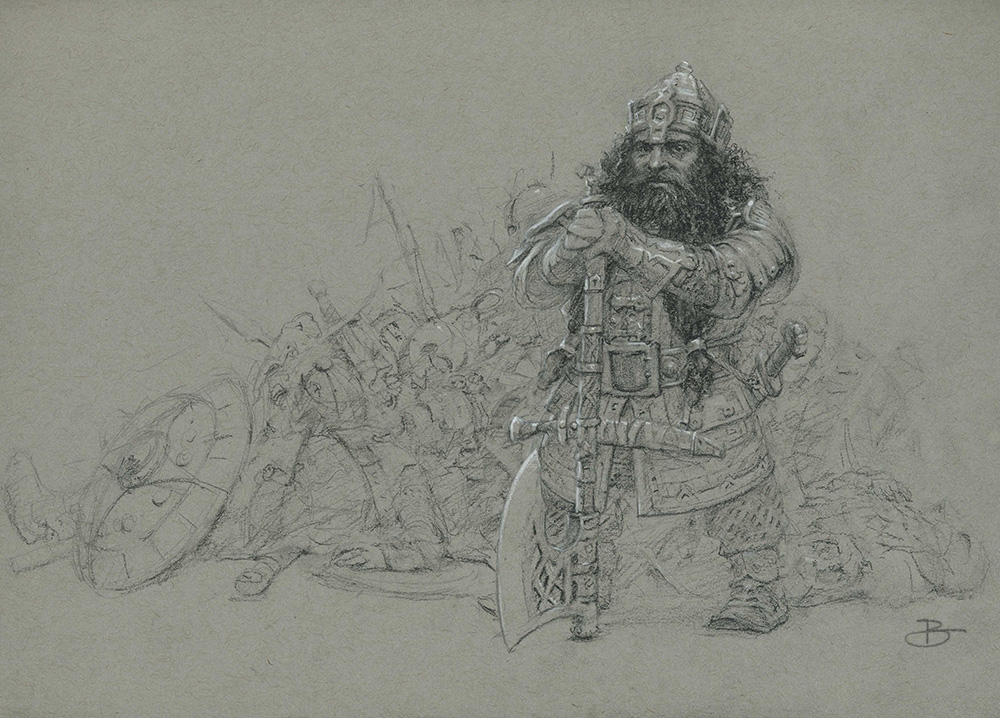
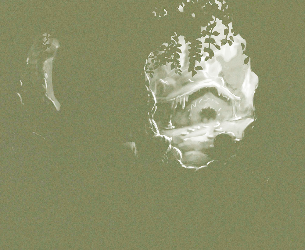
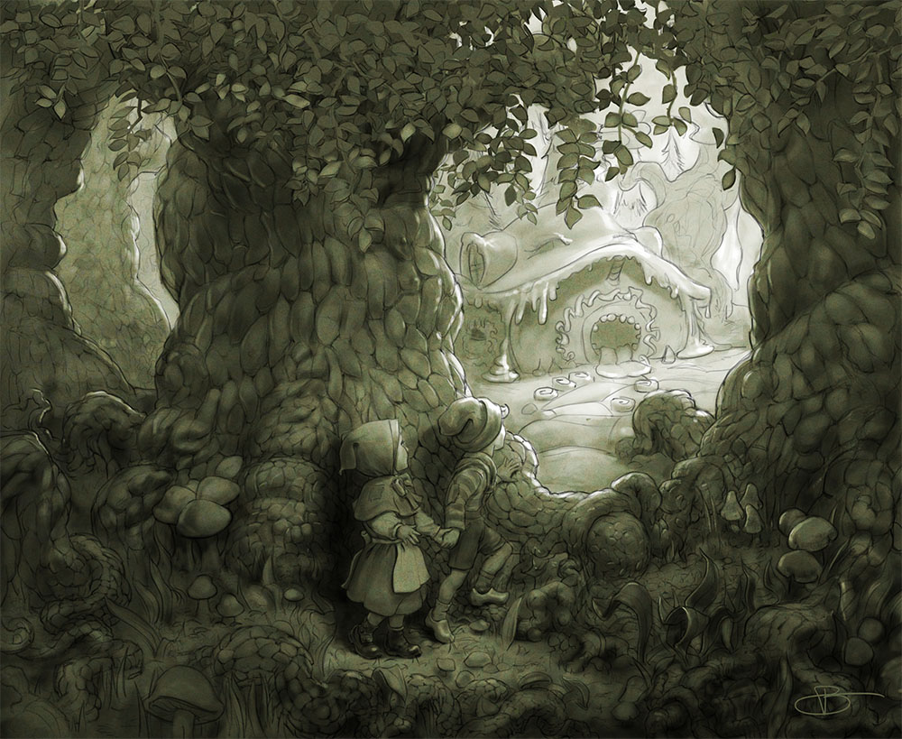
My art school drawings did not look like this…
Isolating the Middle Value
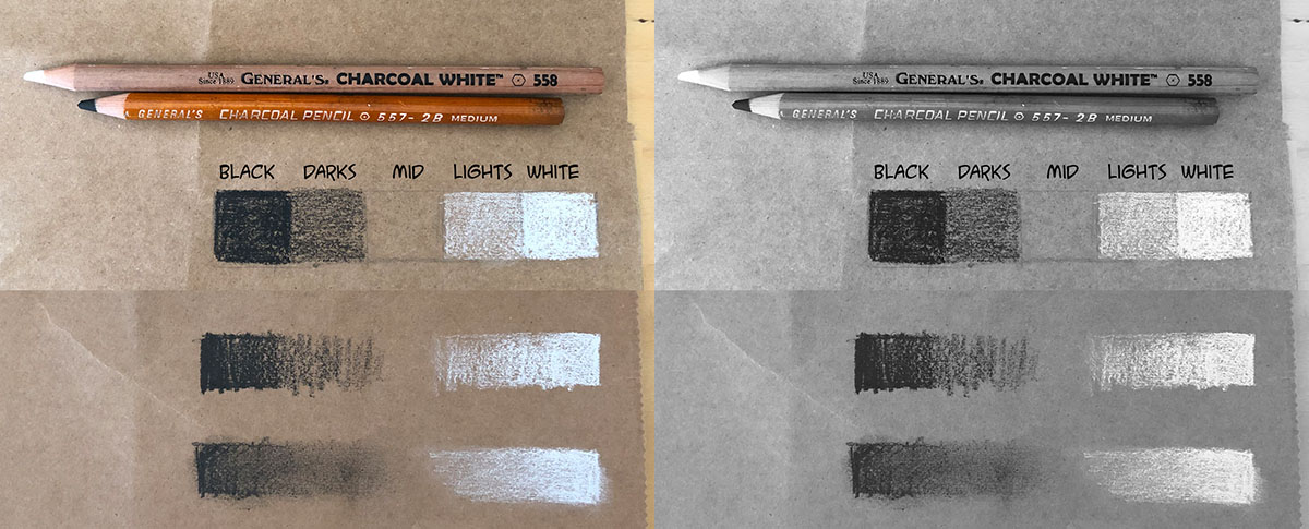
This exercise was intended to help us organize values (tones, light/darkness) by assigning a different material to each value range: charcoal for the darks, white chalk for the lights, and the paper itself for the mids. The black (charcoal) and white (chalk) are not allowed to mix. Most importantly: the middle value was thereby its own separate thing, its own dedicated medium. With toned paper blank=mid-tone, and as soon as you put a mark on it you move into the dark or the light value range.

With any toned paper you are constantly aware of where you are on the value scale, but the values fuse more powerfully in monochrome / grayscale.
The middle value is a central and stable platform on which to build a value structure. Sort of a divide and conquer. This is the opposite of what happens with the standard approach of making dark marks on white ground (e.g. pencil on paper), where the only solid anchor points are white and black, and the middle is impossible to nail down due to the relativity of value perception, and simultaneous contrast.
The toned ground doesn’t need to be exactly 50% value—the important thing is that it stakes out a specific value somewhere in the mid-range, whatever is appropriate for the given picture, and then it is always there as a reference. Toned paper is like having a value scale baked into the medium.
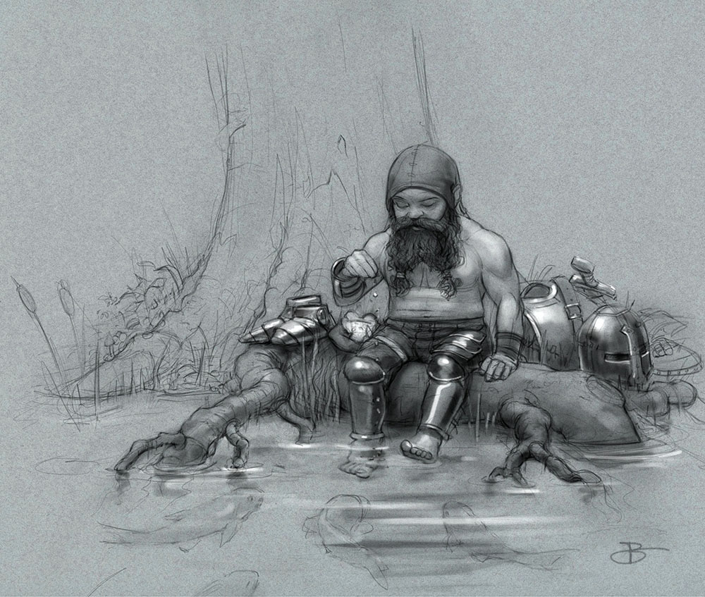
These are two of my first toned paper drawings, and a similar drawing done digitally:
My first toned paper drawings
I found myself having to use gouache to get the kind of control over the whites that I needed, which quickly led me to working digitally instead.
Similar drawing done digitally
I like digital because white covers as well and as cleanly as black, and I can even more concretely isolate the three mediums (white, black, paper/ground). Also, with digital media I can make the “paper” any color I want—and with finished toned paper work being able to control the color and value of the ground are very important.
Digital “paper” can be any color and value you want
Thinking like a painter
The inherent bias in black on white media steers us away from thinking in terms of making middle value shapes, urging us instead to think in terms of line/darks vs blankness, with the middle values being a kind of unrecognized, understated, under-realized, byproduct that appears, often vaguely and timidly between these other two via “shading”. This can lead to uncertainty and lack of confidence when it comes to painting, which at its heart is simply composing a picture with value shapes.
Value shapes are the foundation of a painting
In painting we must consider all values equally, and we often do away with line entirely. This can be a hard transition to make. Often, without line, our pictures fall apart, because the underlying value structure is not there. Similarly, often pictures look better in the drawing phase, and weaker by the addition of color (which simultaneously introduces value). Because, though drawing is the foundation of painting, good drawing skills do not automatically grant painting skills, as what typifies painting is value control and organization.
Working with toned paper (or a toned digital ground) is a great bridge between drawing and painting, because it retains the familiarity of drawing while encouraging you to think like a painter. Once you start composing in value shapes you are thinking like a painter, because that is what painting is. With a toned ground you erase not to remove dark marks, but to make middle value marks. This simple change of perspective will have you seeing and thinking more like a painter.
Toned paper can be a bridge between drawing and painting
Getting Started
To get started with toned paper I suggest doing most of the drawing with black (or something dark), then introducing white as needed. This alone will probably fundamentally change how you see and what you produce. For example, if this drawing were done on white paper I would have had to cover most of it with pencil, in order to create the tiny white highlights on the hair, the face, the ball and the frog, by leaving little blank spots of paper.
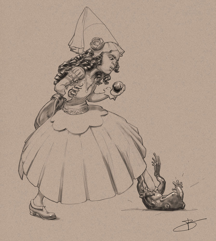
Here the approach is the same, using white for highlights and also to create focus (on the face). The branch, for example, stays in the dark range, with no whites.
Using white (or not) for surface properties and focus
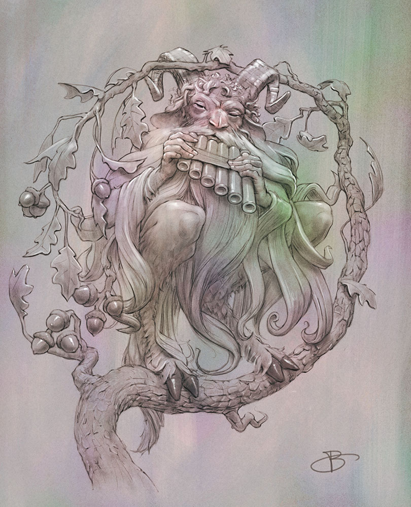
From there you can begin to introduce the use of white for white/light-colored things, still holding the picture together with line.
Using white for white-colored things
A toned ground makes it more straightforward to control the key (overall lightness / darkness of the image) by distribution of lights vs. darks over the medium ground. This picture, for example, has more lights than darks, but, unlike if I’d sketched it on white paper, is still mostly mids.

Setting the key via the choice of toned ground
And with toned paper it is very straightforward to create simple compositions using a few big value shapes
Simple three-value structure on toned paper
This is not to say that you can’t create a fully tonal drawing on white paper—you can, beautifully. It’s just more work, because in a tonal drawing most of the values are in the middle, and it’s not a great training tool for thinking in value, because with white paper you are working in a value vacuum.
After a few drawings like this your brain should start to make the mental shift where you think of value and value shapes separate from, but in parallel with line and drawing. You think of what value you want where, and how to create that value. Even if you return to mostly working black on white, you will hopefully have acquired a new superpower.
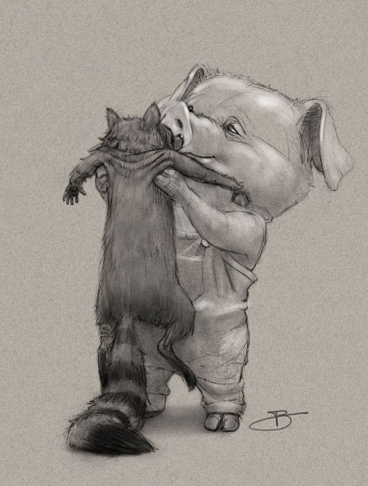
The Magic of the Middle
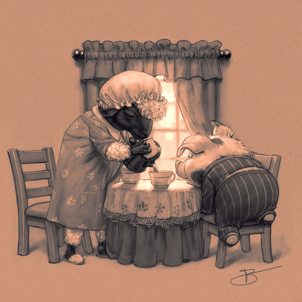
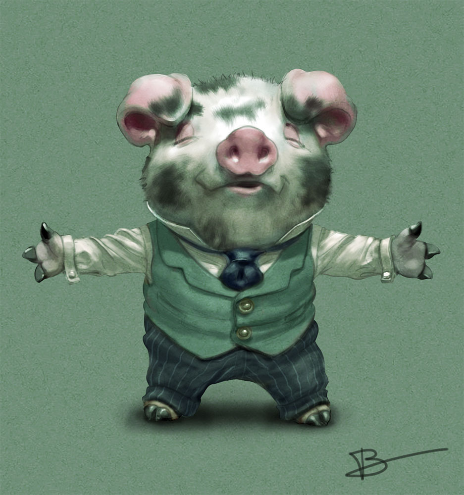
In this toned paper drawing of Hudson reaching for his cocoa, many of the transitions are smooth and soft, so you’re not immediately made aware of whether you are looking at blank paper or paper with some white or black laid on. This is where value organization moves into the magic zone, where you can’t tell what most of the values are in the absolute sense. Two values on opposite sides of the picture may look the same, but if measured turn out to be different, and vice versa. By creating a drawing in this way you always know where you are on the value scale because of the central toned paper anchor.
Toned paper helps you set up value relationships
This allows you to create relative value relationships that transcend that simple linear scale. In this picture, for example, you could almost be convinced that the highlights on the tie contain some white (they don’t), and the light stripes on the pants seem to be some other color or value that doesn’t exist anywhere else in the picture. They seem to have some whiteness but at the same time do not appear to be made of actual white marks.
The magic of the middle: striped pants and highlights on the tie.
Our brains are great at decoding the “fact” that the light (mid-value paper) spots on the tie and the white spots on the face and buttons are all highlights (reflections of the light). So in that sense they are “the same thing” and this other dimension competes with or even overrides the actual objectively measurable values, which are not the same—because that mathematical fact is unimportant for interpreting and surviving the physical world. When the same middle value appears in one context as a light, and elsewhere as a dark (shadow), say, on the shirt, we have transformed a simple linear value scale into a multi-dimensional thing.
Blacks are always dark, and whites are always light, but the middle value can read as or represent either depending on context. The same middle value can be both the darks of the lights (the shadow areas in the shirt), and the lights of the darks (pants and tie). The closer to the middle a value is, the more capable it is of this doing this contextual double duty. As such, middle values have a special role in painting.
Light
Value organization is critical for creating the illusion of light. We instinctively think light is about contrast, so if we turn up the contrast we get more light. In fact, the brightest light you will encounter in your life (the sun) creates very bright shadows as it reflects and refracts its way into them. These shadows are mostly middle values, not darks.
So whether you’re going for stark and dramatic light like Caravaggio, or airy light like an Impressionist, you need to set up value relationships—and that is where toned paper can help a lot. By strictly separating the white from the black, via the intervening and connecting mids, and by anchoring the picture firmly in the middle, we gain a lot of insight and control, and can create something like a very simple painting with only these few tools.
The basic building blocks of a painting.
This picture is a complete statement which holds together despite lacking in sharpness and detail. It is kind of inside out. It has no lines or clearly defined edges, yet it stands strong based on value relationships alone. If you have trouble with painting vs. drawing, if your paintings sometimes turn out disappointing relative to the drawings on which you started them, this type of approach will isolate the problem.
Creating something like this using a toned ground is very straightforward because the value scale is baked right into the medium. Using only black (on the toned paper) in the foreground keeps it within a specific value range.

The middle-valued paper is a clear separator between lights and darks.
Same with the background, using white almost exclusively. I might have been tempted to throw some white into the foreground, but if I had it would have asked for more and more, and before long I would have lost the value structure.
Very small bits of white appear only on the fringes of the foreground.
Now to include the line—which adds a lot, but is not necessary because the value structure is there on its own.
The line adds its own, different thing.
Neither the line nor the value is dependent on the other. The drawing, too, can stand on its own—but that is not the focus of this piece, as most artists find this much more achievable than solid value organization:
This is the easy part.
Separating them shows that each makes a very different contribution to the final picture. If I were to develop the painting aspect and gradually eliminate the line (which is actually how I work), the drawing would still be making its contribution, but in the absence of an explicit line.
Getting to the point where you don’t need line is a big step. That’s not to say you don’t want to use line as a stylistic choice, but if you don’t need it that means your values are able to stand up by themselves, and therefore using line is a decision and not a dependency.
Color
Working with toned paper is also a great way to get a handle on color, because color is very much about value. You can start by introducing a single color as a fourth value, for example. Here the yellow sits natively between the middle value paper and the white.
Value and color locked in a four-value picture
And here the single color is an alternate mid value:

With toned paper you start to think of white as a color, not as the absence of color. White becomes an equal composition element:

White as color and value, not the absence of marks.
Composing
Working with toned paper will change how you conceive pictorial ideas. You will start to think in terms of arranging value shapes. This may open up whole new worlds for you, if it’s not something you’ve done much before.


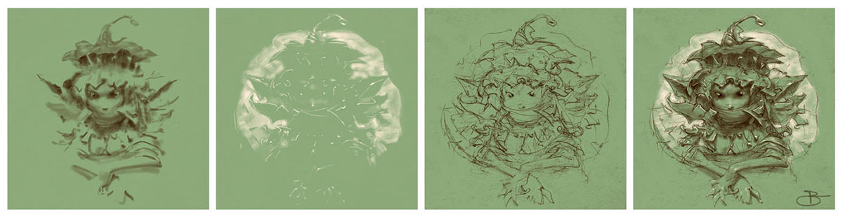
Two Friends: design in color and value
The simple digital setup
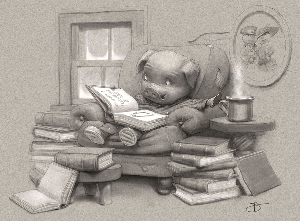
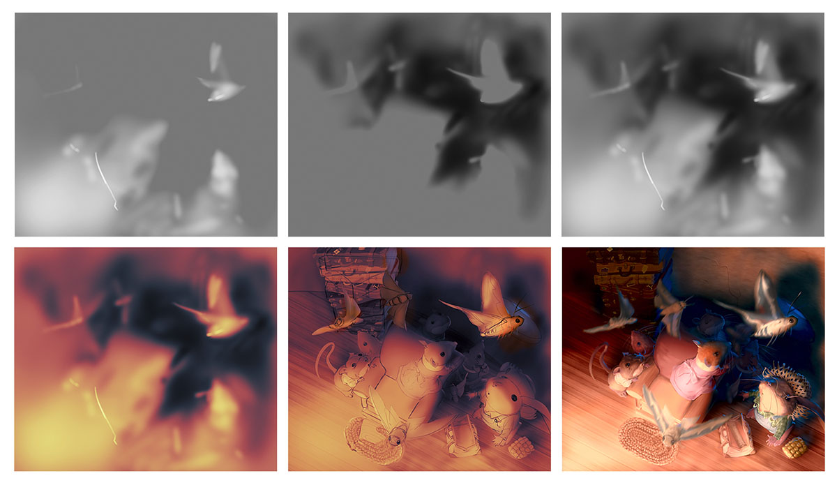
Toned paper is a powerful tool for doing quick value studies or painting-like drawings

Toned paper studies and quick drawings
Because a toned ground, black and white provide all the basic building blocks of a painting. When the whole of these combined elements is stronger than the drawing by itself, you know you some magic is starting to happen with value relationships.
When the whole is greater than the sum of the parts
This “democratizing of value” brings us full circle to where, even when working on a white ground, the white is a conscious choice, not simply the default. And, like every other color and value, it is an integral part of the picture, not some blankness upon which the actual picture sits. This, again, is thinking more like a painter.

Not toned paper, but paper color as a conscious decision.
Painting
For me, starting with a middle value ground is standard operating procedure when roughing out a painting. I start with a middle gray, then I paint black and white over that. I stake out the middle and build to the ends, like a pyramid that extends in both directions.
Developing a painting on toned ground
And when I draw on white paper (which I do a lot) I am very aware of the middle value (range) as its own special thing, and white (the paper) is just one of the values available.
White, black and gray (mid-tone) on white paper
Working on a toned ground may introduce such an abrupt change of perspective that feels very uncomfortable at first. You may discover you have a massive blind spot for the “magic of the middle”. That’s great! That means you are learning. You have just opened a new door.
Confronting our biases and limitations which is always uncomfortable is how we grow. Even a little of this practice will inform your value and color work regardless of your preferred medium. Then, whether you want to continue working this way or not, whether you want to only do line drawings, etc., are choices, not limitations.
So if you want to improve your value-thinking, give toned paper (physical or digital) a try. I hear Strathmore makes a nice toned gray sketchbook that is at least slightly better quality than a shopping bag. Now let’s go get toned!
This post takes me back to my early student days. it took me some time to learn the value of toned substrate … I was an idiot. Your article is one of the best overview on the subject I have read.
Thanks! I was an idiot too. Now I’m less of one. Making art is a humbling experience.
Wow! Love this post, Chris! I really found hard drawing on toned paper, here I found a lot of great tips. thanks
Excellent! Good luck!
Amazing. Thank you for another amazing post, Chris. Your articles keep blowing me away.
You’re absolutely correct, I’ve been struggling with value as I’ve been making the transition from drawing to painting. During this transition I’ve found myself drawing on toned paper more and more. It’s nice to understand why I’ve been drawn to it (pun not intended). I’ll be working to pay more conscious attention to simplifying and organizing my shapes and values so I can really take advantage of working on a toned surface.
Any tips or recommendation on toning traditional media surfaces? I often work on a white board because I can wipe out to get the bright highlights but I’m thinking it might be good for my brain to build up my lights instead, at least for a little while I get a better grasp on seeing and mixing my value relations.
This is so good to hear, thanks for the note, Carly. It makes a big difference when you know people are reading! I wish I could advise you on toning traditional media surfaces. More and more I find myself transplanting my traditional tools to digital media, where it’s no hassle to (for example) create whatever color and size of paper I want. I guess it’s weird to work digitally but use tools that are so simple, but it’s what feels natural for me. But for physical paper I do have a gray Canson sketchbook which is really nice. It takes all dry media and gouache very well. Problem is it’s colorless.
Whoops, Michael Flint’s post just reminded me–the sketchbook in question is Strathmore, not Canson.
What a comprehensive post! I love working on toned paper – saving the whites til the very end. I do most of my sketching in small 5.5″x8.5″ sketchbooks and was excited to recently find a Strathmore toned gray in that size. I’ve also played with “toning” a sheet with watercolors (in color) and drawing on top of that.
Thanks, Michael. Last night Dan asked me if I wanted to split it up, and I was like, “It’s not that long.” But now that I see it… uh, yeah, it is. But I’m glad you found it informative.
I have that Strathmore book in the 8.5 x 11 size. It is a perfect value / color for getting a handle on value work, because that gray connects very well with just about any black or white.
As always, your posts are mind blowing Chris. I specially love the b+w on toned paper PLUS colour (that orange in the beak and legs of the duck are awesome).
Thank you SO much for the great note, tayete. I love using one color plus a simple value scale too. I don’t know, I just like using a small toolset and seeing how much I can do with it. With digital painting and CGI being essentially unlimited at this point in what they can depict, fully animated in super high res, I find myself more interested in “less is more” these days.
This is really useful! I started working digitally because it made it easier to apply white on a toned ground. I hadn’t thought to try doing different colors for the ground like that and still keeping it simple. I’m going to try that. Thanks!
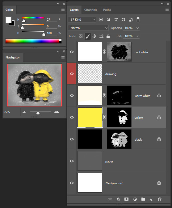
Yeah, using digital tools in very simple ways gives you a lot of control. I usually have the paper on one layer, then separate layers for the drawing, black, and white. For the black and white layers, I fill the layer with each color, then paint on the mask. This way you never have to color pick. You just paint/ draw in white on the appropriate mask. And also you can change the white or black (say you want a warmer white or whatever) with a simple fill, or using a Hue/Saturation layer clipped to it. And I put a Hue/ Saturation layer above the paper too, so I can fine tune that.
Right in time! I was looking for something like this for a long time. Thank you a lot!
I’m glad it was meaningful to you!
I never thought about toned paper this way, or how useful it can be. Definitely something I need to start using more often!
That’s great, hena. I wish I’d understood it earlier.
I was about to ask about the paper and you give it’s name at the very end of the post 🙂 Thanks a lot, very interesting tutorial.
i love the work of Chris B, he transports me to his world always, It is difficult for me to pass the quality of my oil paintings to the digital style, I must be the only case in the world that takes longer in digital than oil xD ’cause it’s flat without “life”.
I love his work too. The guy is amazing! Anyway, you raise a good point about digital work. For many it is a lot easier and faster, and for many others, it’s the opposite. I have done a lot of work in both, and what I can say is with traditional work, the medium itself adds a lot of beauty. You can make a single brushstroke of any color on a piece of watercolor paper, and the mark has beauty and depth. You can zoom in on it more and more, and it becomes even more interesting. That in turn is very compelling to work with, and fuels you to keep going. But, the challenge, conversely, is control. Traditional materials are a lot harder to control. Painting black on white is more forgiving than white on black. You can’t completely remove marks. You can’t simply use an eyedropper to match color, etc. etc. The silver lining to that, though, is that since the consequences of every mark you make are significant, it brings a heightened sense of awareness and focus to the performance.
With digital, it’s the opposite. It is consequence-free, and easy to control (once you learn it). The problem is, it’s inherently ugly. Ugly, ugly, UGLY. Or, as you put it so well, probably better, “without life.” Depending on your style and the look you are going for, it takes a lot of effort to make it simply not ugly, to give it some life, let alone to make it beautiful–especially if the goal is not to seek beauty by simply mimicking traditional materials. And this lifelessness is crippling to the creative process. Your creative brain just turns off, I know.
Ivan, my advice to you is to find your own digital process and borrow from your traditional process only where it feels right. I have explored many different approaches to digital work before I settled on one, one which I would never have come up with traditionally, because it’s basically not possible to do traditionally, as it involves switching between drawing and painting throughout the process.
Good luck!
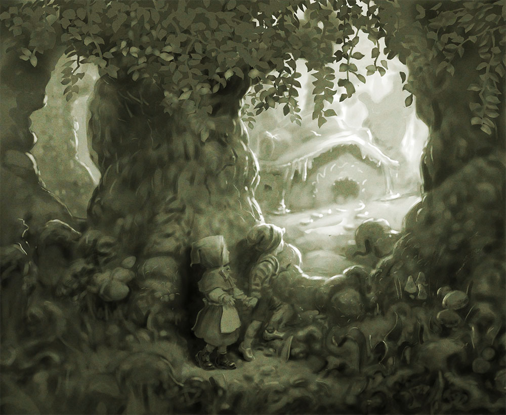
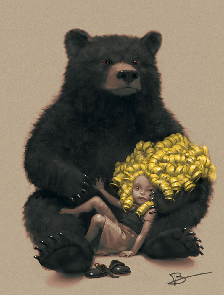
I loved the art on brown paper. I especially liked Goldie Locks and the Bear. I looked and studied these for a long time.
I’m glad it helps you.
It is indeed.
Wow, I took so much from this article, thanks Chris. I’ve been dabbling with toned paper lately and have definitely noticed a marked improvement in my work and it has also paid off with paint too. I love the idea of using gouache to get extra control over the whites too. I’m also now feeling a little more curious to jump into some digital art in this style. Thanks again for a great, informative and inspiring post!
love. I’ve been struggling with value as I’ve been making the transition from drawing to painting. During this transition I’ve found myself drawing on toned paper more and more. It’s nice to understand why I’ve been drawn to it (pun not intended). I’ll be working to pay more conscious attention to simplifying and organizing my shapes and values so I can really take advantage of working on a toned surface.
play crazy game crazycattle.org
This article provides a clear explanation of how toned paper simplifies value control, especially for beginners. The comparison between traditional and digital methods is insightful and practical.
Welcome to Crazy Cattle 3D
A battle royale rage game about sheep; will you have what it takes to survive in Crazy Cattle 3D?
Crazy Cattle 3D combines physics with chaos, skill with strategy. Control your explosive sheep in Crazy Cattle 3D across three unique environments. Master momentum, use terrain, and become the last sheep standing in the chaotic world of Crazy Cattle 3D!
What an interesting idea! I loved the art on brown paper.
Wow, this is actually super helpful! I never thought about how toned paper could make such a difference. Gonna try this out with my sketches, see if it boosts my value control. Thanks for the tips!
Ah, that’s a cool way to look at it! I never really thought about toned paper in that much detail. It makes sense that it helps you understand values better.
COMMENT
I have read your excellent post This is a great job I have enjoyed reading your post first time I want to say thanks for this post.
That’s a fun full-circle moment with the paper bags! Using them as toned ground for art sounds like a brilliant way to explore new drawing techniques, and it’s a clever incentive to fill them with healthy groceries too.
Wow, this is actually super helpful! I never thought about how toned paper could make such a difference. Gonna try this out with my sketches, see if it boosts my value control. Thanks for the tips!
Using cheap brown paper, chalk, and charcoal sounds like a fun challenge. I’m curious to see how that exercise helped you later on!
Gonna try this out with my sketches, see if it boosts my value control. Thanks for the tips!
What a great post on toned paper! I totally get that art school moment of confusion. Using grocery bags, white chalk, and charcoal sounds like a wild, yet brilliant, assignment. It’s so cool how those simple, almost primitive, tools teach such a valuable lesson you now understand. Thanks for sharing!