The subject matter might not be the most interesting to you, but believe me when I say this is the best subject you can study from when it comes to learning how to see color. The still life is used in academic painting to learn how to emulate various surfaces beyond flesh that is rigorously studied in all the life drawing and painting classes. I also want to point out that studying color and form from photography is never the best choice as the photo loses more than 20 percent of what we see with our own eyes within its technical limitations and constraints. Still life set ups can include anything, can be set up anywhere, and should be practiced often to level up your eye, your awareness of light and its effects on form, and your dexterity.
The limited color palette teaches how to find hues in the secondary and tertiary levels of mixing, that a limited palette has as much strength in capturing a likeness as a full prismatic palette, and how to relate colors together when the subject sometimes exhibits wild hues not found in our own palette. The experience also warrants understanding what limitation means and helps the artist understand how to compensate and still achieve a satisfying result.
Here is today’s subject.
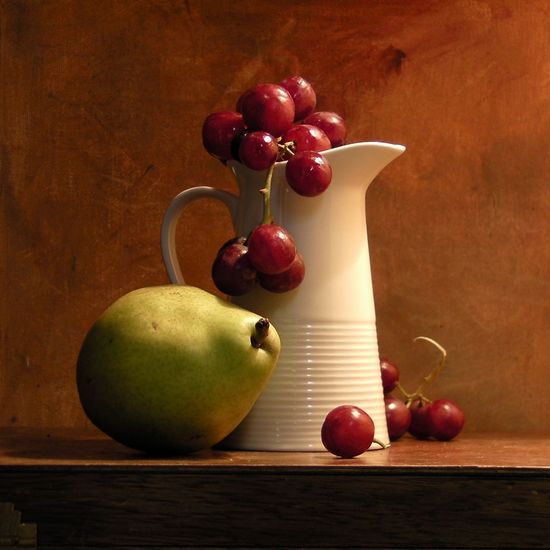
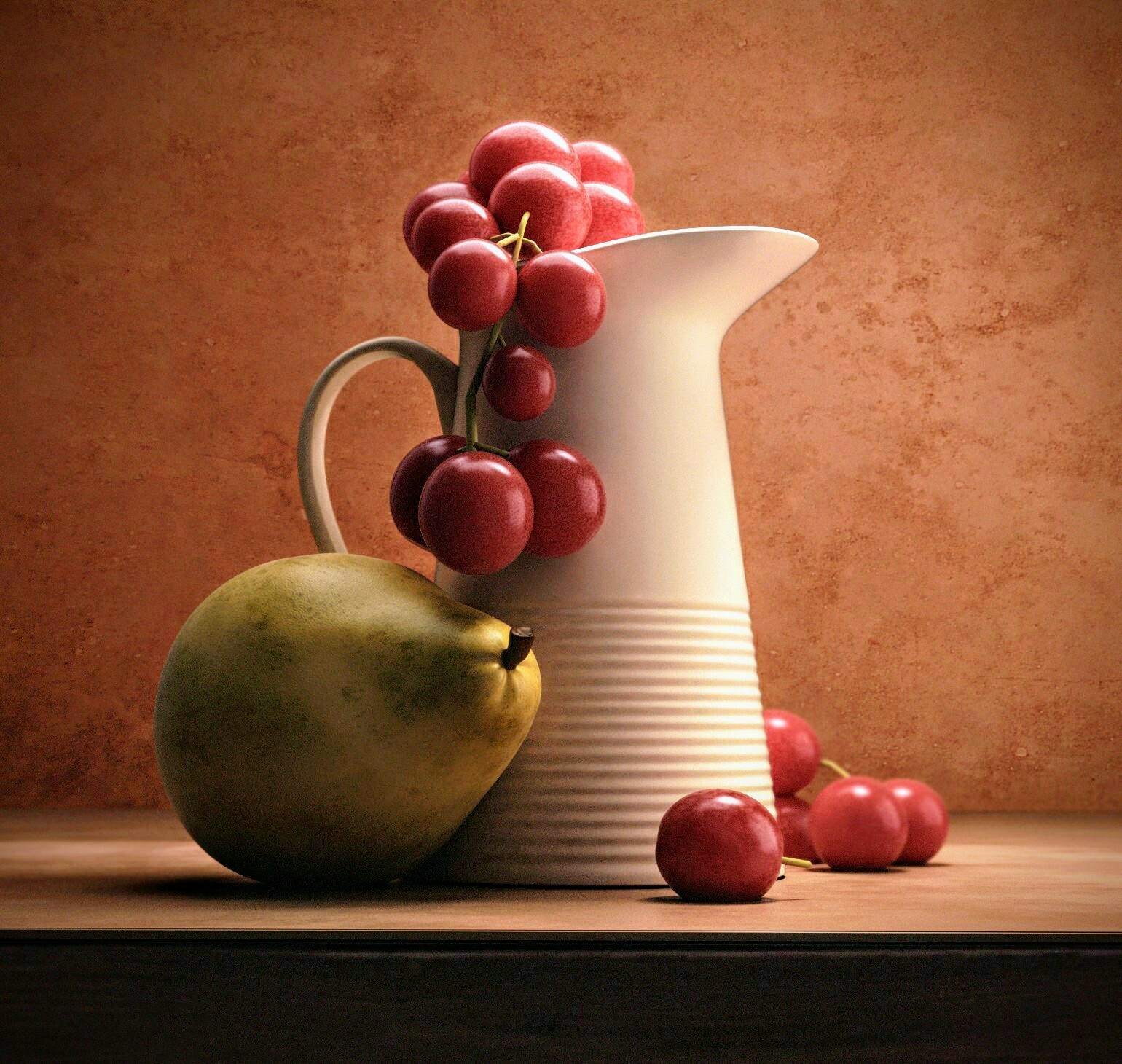
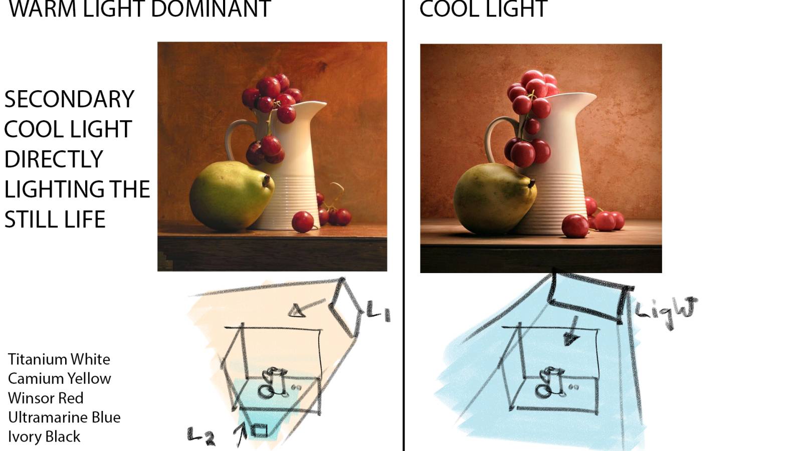
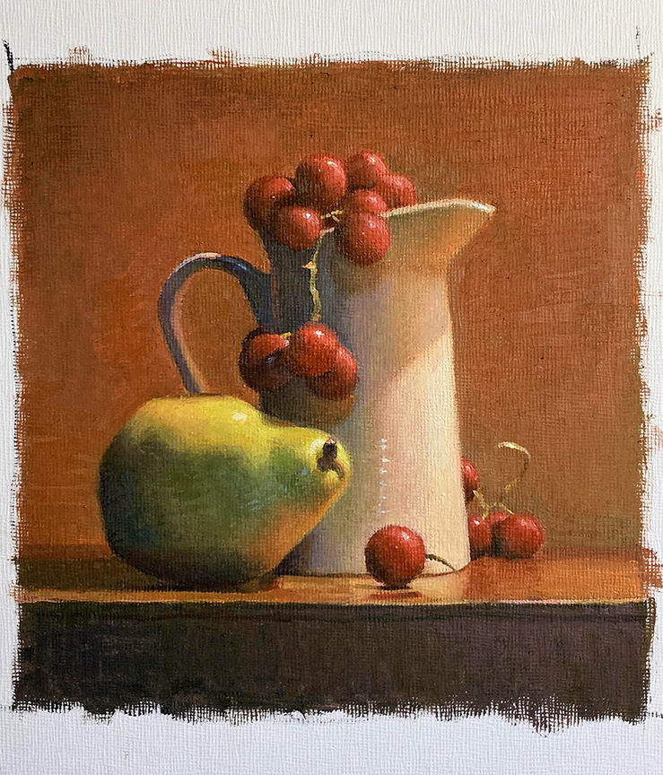
Between the two shots, A is shot with a dual light warm/cool set up, B is shot with a single light source, cool light. The first image will require a clean bright yellow, the second image can be achieved with the Classical limited palette. Why? Look at both images, the pear looks very different in its color profile because of the limited light and the temperature of the light. The first image has two lights, one of them warm, forcing the yellow to warm up more and requiring some other yellow other than ochre to solve the problem.
This choice in palette is made by observing the subject matter and picking the most rational group of colors that can achieve the chroma range within the scene.
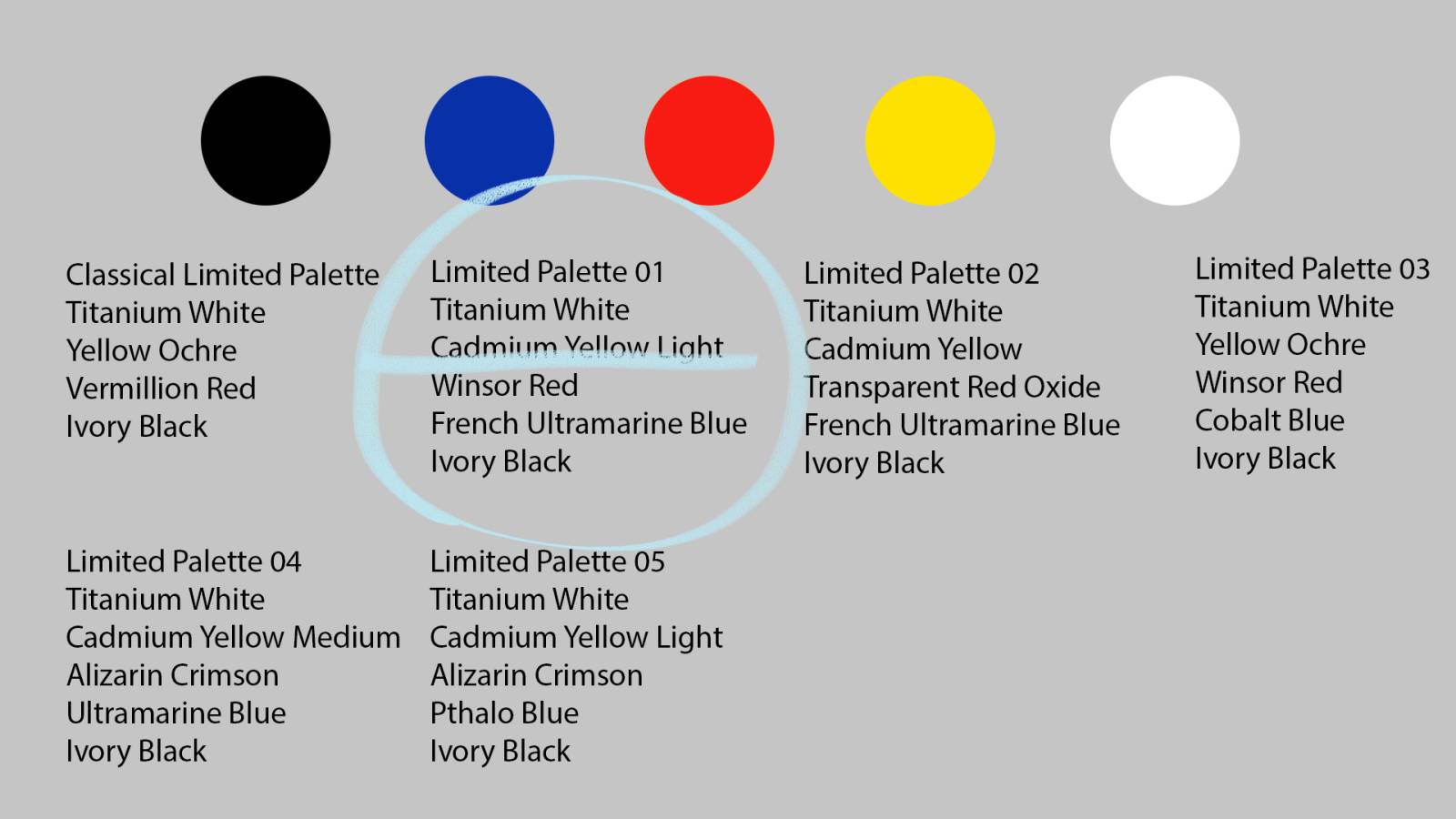
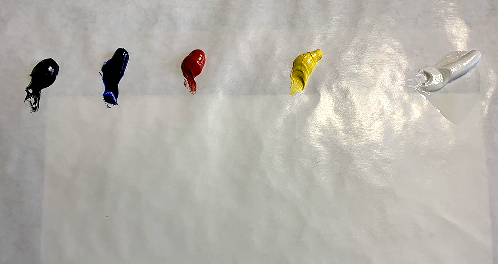
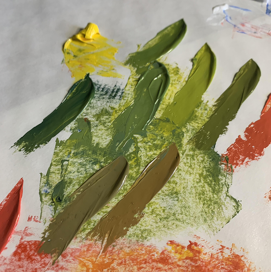
Here are a few different limited color palettes that can achieve a broad range of color mixtures. The palette is determined by the chromatic qualities of each primary. The palette I chose is due to the intensity of the yellow, needing a hue that can reach the particular range in the image.
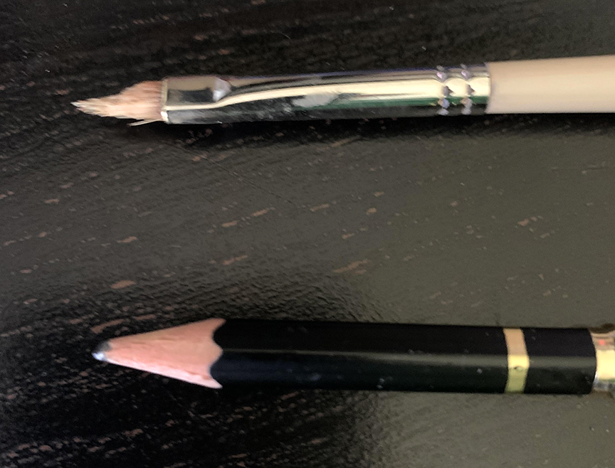
The painting was painted on a really cheap canvas board, I have no idea where I got them or what brand they are. The tooth was horrible but semi manageable for the demonstration. I used this brush to paint the picture, a Robert Simmons filbert size 2, now ground down to a size 1.
Color exercises do not need to be done on precious, expensive surfaces. In fact, any exercise you do that is foundation related, use cardboard or any other form of surface that you can find in your garage or closets, or heading for the trash. Gesso the surface and you have a practice surface that you can sacrifice without every feeling any shred of guilt.
Here is a minor breakdown of the image where the major and minor color notes are and what hue to shoot for. Each color is relative to its local value or light/shadow value, so when you read red or blue, it is not just that hue involved in the mixture, and not as vibrant as the word might sound. Due to me resaving this photo again, the hues might not be as vibrant as much as in the first image on this page.
Can you see the hues that I described once you have read my color description? If we are new to color we might not see these subtleties at first glance. It is through comparing to the other colors in the same image, and/or developing a sensitivity to color through paint training that they will become more and more visibly apparent.

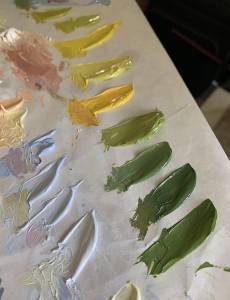
The first step in starting the painting is to mix the secondary and tertiary hues with the palette. This reveals the range of hues achievable by the palette and reminds the painter that the other colors needed are present but need to be extrapolated.
The next step is to premix all the major hues visibly seen in the set up/reference image. By premixing the major colors and having them assembled together on the palette can give the painter a preview of what is going to be used before the first brushstroke is applied. The relative harmony of colors on the palette should visually feel the same as the reference. Over time the painter will learn to develop an eye for instantly spotting these subtle nuances.
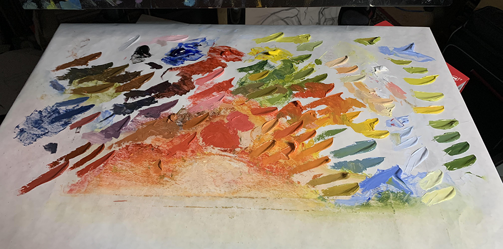
I have to admit, this article was done rather fast and I had no time to really prepare between the jobs I am completing so this palette is a bit disorganized in its appearance, but totally makes sense to me when I work. Notice that not only do I have secondary and tertiary hues mixed, but I also have strings of value with several of them for adjusting the surfaces as they move out of our view.
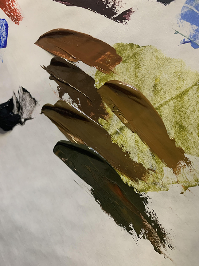
The greys – or low chroma hues, aka browns.
The greens, both warm and cool temperatures in relative mixtures.
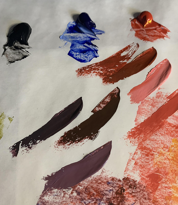

The purples warm and cool for the shadow areas.
The oranges warm and cool, cooled by green and warmed by yellow.
Before I describe the breakdown, I want to again mention that because of time constraints, I approached this painting as an impressionist would, starting with color spots and not a drawing. Once you have the skills to draw, you can omit the step knowing that you are now drawing in color and all the skills you have acquired can elevate the freedom to start a picture any way you choose. Also knowing myself, the drawing would have taken a lot of time as its own step, then I would have been too careful to follow the shapes rather than allowing myself a little wiggle room to paint freely.
With the palette established, the painting stage can commence, starting with the largest spots of color to establish their local value relationships. This step in Impressionism is known as “spotting”, or “color blocking”. Each hue is placed roughly in its final location, each spot of color increasing in scale until they run into one another. There is also a lot of design at work here guiding me in several different measuring methods to get the shapes close in scale and placement.
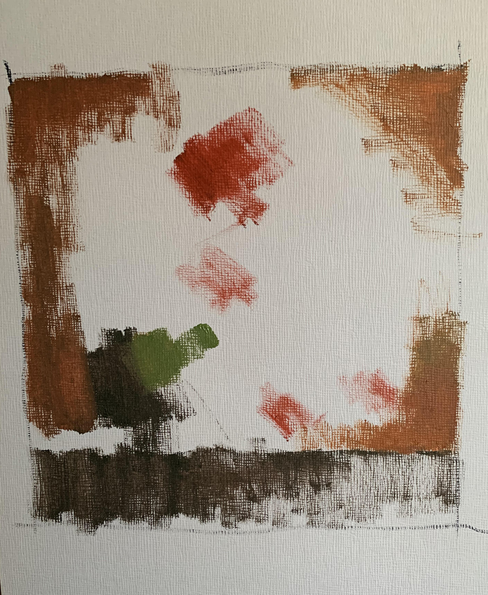
These steps are the most critical in the process as they establish the overall space and scale of the shape language, and help to achieve the feeling of the correct lighting and shadow feeling right from the start.
As the spots expand, their exacting shape language is clarified, the planes each color represents or the shape groupings that share a common hue. In this case, I grouped the cherries together in each cluster forgetting about how to draw circles for the moment to set up the color space. If you have perfected your drawing skills or are highly skilled in them, you are constantly drawing and can find the exacting shape, edge, and form in the last few brushstrokes you place, if you choose.
The light is clear to me, the contrast is as strong as in the photo, and I am safe to continue growing the shapes into one another. I am still freed up from having to think critically about exacting proportions and have a lot of freedom to adjust colors without fear of losing a precious shape.
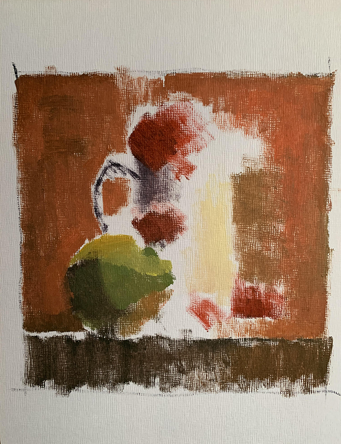
To show the rest of this without a bazillion stages in between, I am showing the finish at an early stage, and the final painting to compare them.
In this version, as with many of mine, the colors start off a little too chromatic all over, I haven’t quite established in my mind which are chromatic and which are greyed more. It is when all the colors are assembled as this example shows that I can finally see what needs to be adjusted. Since I am working from a photo, I know there are colors missing from the image that would really make a much nicer transition, but for now I am keeping those out of the image to maintain an objective relationship with the photo that you all see.
As an example, I notice that I responded to the backdrop by making it too chromatic in the orange family, and needed to temper it or I would be limited in the range I can use in the cherries, and the overall effect feels too hot for any of the other hues to work harmoniously.
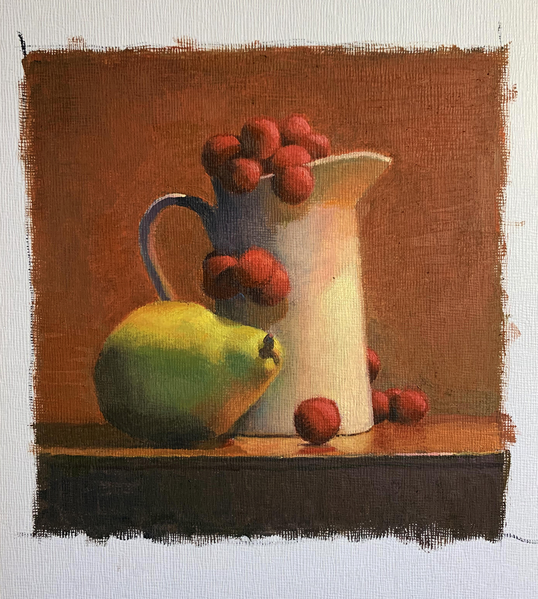
This is the painting right up to the last few stages, notice that none of the cherry stems have been included, the highlights, or and nuanced edges of detail. These small items get in the way of the big picture and solving the transitions of the bigger masses, so they are left out until the biggest shapes and volumes have been correctly and orderly built in relationship to each other.
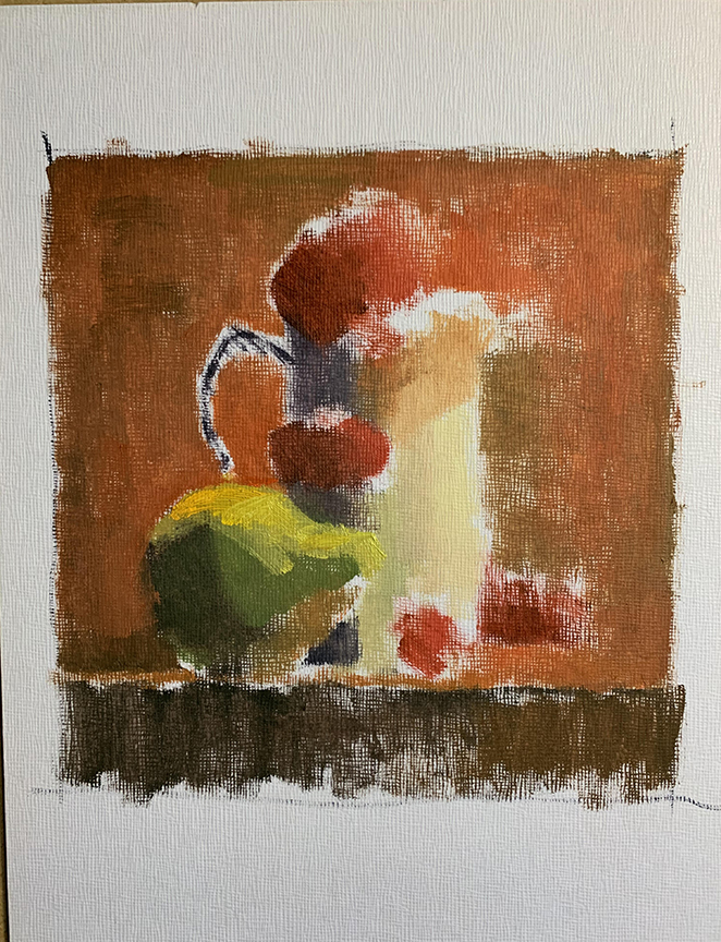
The forward facing cool light source was also throwing me off at first with the pear. I was seeing too much blue in it and not enough blue elsewhere to justify using that blue. But once I really broke down the image, I started to notice where the other blue hues were, noticing through the compression of the neutral areas, and a balance was once again established.
These photos are not capturing all the subtlety that the canvas has. As many of you are aware, the original can never be photographed with exacting clarity and unfortunately this article does lack a little direct connectivity because of the image data loss.
There is a lot of bounce light happening in this image but due to the camera compression, they are not as easy to spot. The white pitcher is taking on the bounce light of just about everything in the image including the pear and the cherries. The overall orangey feel of the image makes that difficult to initially spot.
The lines in the pitcher would help relieve the separation of reflected lights behind the pear with greater subtlety. Without them the separation is much more obvious. I did not think about cleaning that up since this was a rather hasty painting, but will take some time to clean them up beyond this tutorial.
The green that was put into the backdrop to temper the orange is likely a result of the blue light that is behind the camera. If you look at both images at the beginning of this article, the photo that was shot with only one light source shows very little to no other color family in the backdrop than the warm orangey hues.
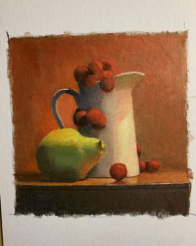
If I made the background any darker, I would have been using more red which would have reduced the importance of the cherries being red. Some color sacrifice in this limited palette was needed to maintain color clarity of the subject matter. Sacrifice is made more often than not in our artistic choices to help strengthen the message or focus of our images.
In the long run, I am disappointed that I isolated the little cherry in the foreground too centered within the pitcher shape. I learn my lesson in giving myself more time to get things finished. I also did not include the ridges on the pitcher as that too would have slowed me down with the added precision that is necessary to maintain their elliptical appearance.
This is my first time taking an actual painting apart in a photo sequence and I am aware that it might need to be broken down into more steps. From this first round I realize where I can make more images to isolate particular color problems and will make adjustments for these absent images in the next installment.

This serie is something to be framed and hanged on every artist’s wall. Thank you Ron!
gooooooooooooood
Wow Amazing Article, I Like It…