It’s been my experience that some jobs require that I really scrape for something to get excited about. Other pieces basically hand the excitement to me on a silver platter. In the case of my painting, Dockside Chef, for Magic: the Gathering, excitement was handed to me in the form of an old man’s face and a bowl of ramen.
The assignment was to paint an old, Japanese ramen chef cooking in his stand, but using…dubious ingredients. Helping him assemble the meal were to be at least three sets of floating spirit chopsticks (the addition of hands was optional). The goal was to have a degree of whimsy with a side-helping of creepiness, but the focus was the old man and his ramen.
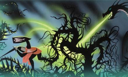
A lot of folks I know would have read the art order for this piece and been less than inspired. And I get it. Who wouldn’t rather be painting dragons and armies clashing? As it turns out…not me. Give me an old man with some ramen any day. I was ready for it.
Now, the first thing I do on a job like this is a deep reference dive. I’m looking for old Japanese men. I’m looking for ramen stands, I’m looking for people holding chopsticks. I’m especially looking for images of delicious, delicious ramen. Then I take all the images I find, collate them, and then meticulously go through them and figure out what I like most and why, and what images most apply to the painting I have to create. My goal is to start to figure out exactly what the various elements that need to be in the piece actually look like so I’m not groping in the dark throughout my entire sketch process.
Then, I get to drawing.
One of the requests made of me was that the spirit chopsticks (possibly with hands) needed to NOT be attached to the chef himself. This eliminated a few things I had floating around in my head—one in particular involved really long spirit arms bent and crammed into the space, with elbows awkwardly sticking out of the stand. Like that idea, a lot of my initial exploration kept pulling the focus away from the chef and I kept having to crop back in and bring my mind (and the viewer) back to the main point of the piece.
After a while, this is what I sketched:
 The assignment requested at least three pairs of floating chopsticks. I felt that the symmetry provided by four was more pleasing. While I did do a version without the hands, the fine folks at Wizards felt the hands worked better.
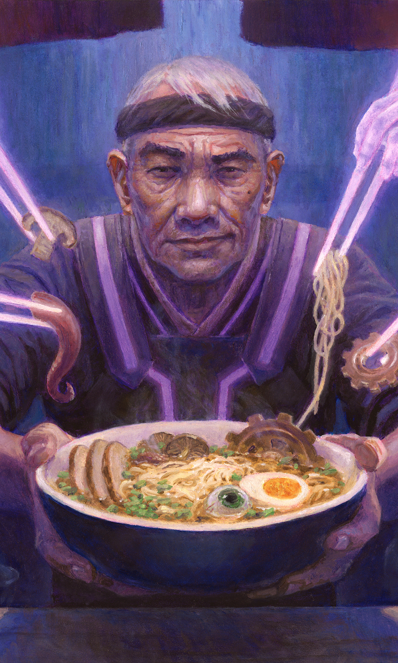
As compositions go, the result wasn’t the most challenging, but the man’s expression and the contents of the bowl were where the primary thrust of the story were. The spirit hands were sort of secondary. To me, the primary mission was to give the face plenty of character and a very knowing expression. The secondary mission (but really more like the second primary mission) was to make a bowl of ramen that was appetizing despite it containing things like eyeballs and cogs. I wanted people to get hungry and be revolted all at the same time. As I constructed the piece, I could accomplish both of those goals clearly and a reasonable degree of visual fidelity would be maintained at card size.
The fine folks at Wizards liked the sketch, for the most part. However, my Art Director did request that I find a way to make the hands end less abruptly and in a way that further sold their ghostly origin. I suggested a sort of smoky trail-off and they seemed to like that.
My life while I was painting this piece was a bit chaotic. Just a couple months before, my wife and I had decided to move across the country and we were prepping our house, shopping for a new one, and packing our belongings for the great migration. So, I needed to be as prepared as possible going into the painting and I needed to get to the finish as quickly as I could. In an effort to achieve maximum preparedness and solve ALL of the problems before I went to paint, I took a day and did this digital color study.
 Then…finally…I went to paint.
 This is an initial pass with acrylic just to drop in some darks, and solidify my drawing and value structure. As you can see, I’ve kept the ghostly hands and chopsticks white in order to preserve their luminosity. Painting light colors on the white of the gesso tends to yield brighter colors and lighter values more quickly, and given what was going on at the time (preparing to move and all) I wanted to make the ghostly glow happen as quickly as I could.
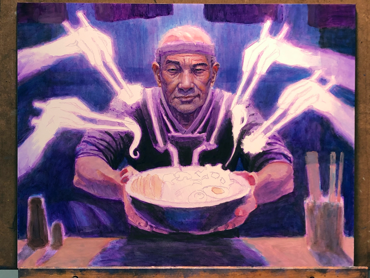
 Not a ton of progress from the last post, but I’ve started to throw down some color here and there, and I started to move forward on one of the major focal points: the face.
 I know this seems like a big jump, but honestly it’s the difference of a couple hours. For the most part, the face is pretty well figured out. Of course I went on to fiddle with it some more, but the major landmarks and the overall color and value structure of the face are pretty locked in.
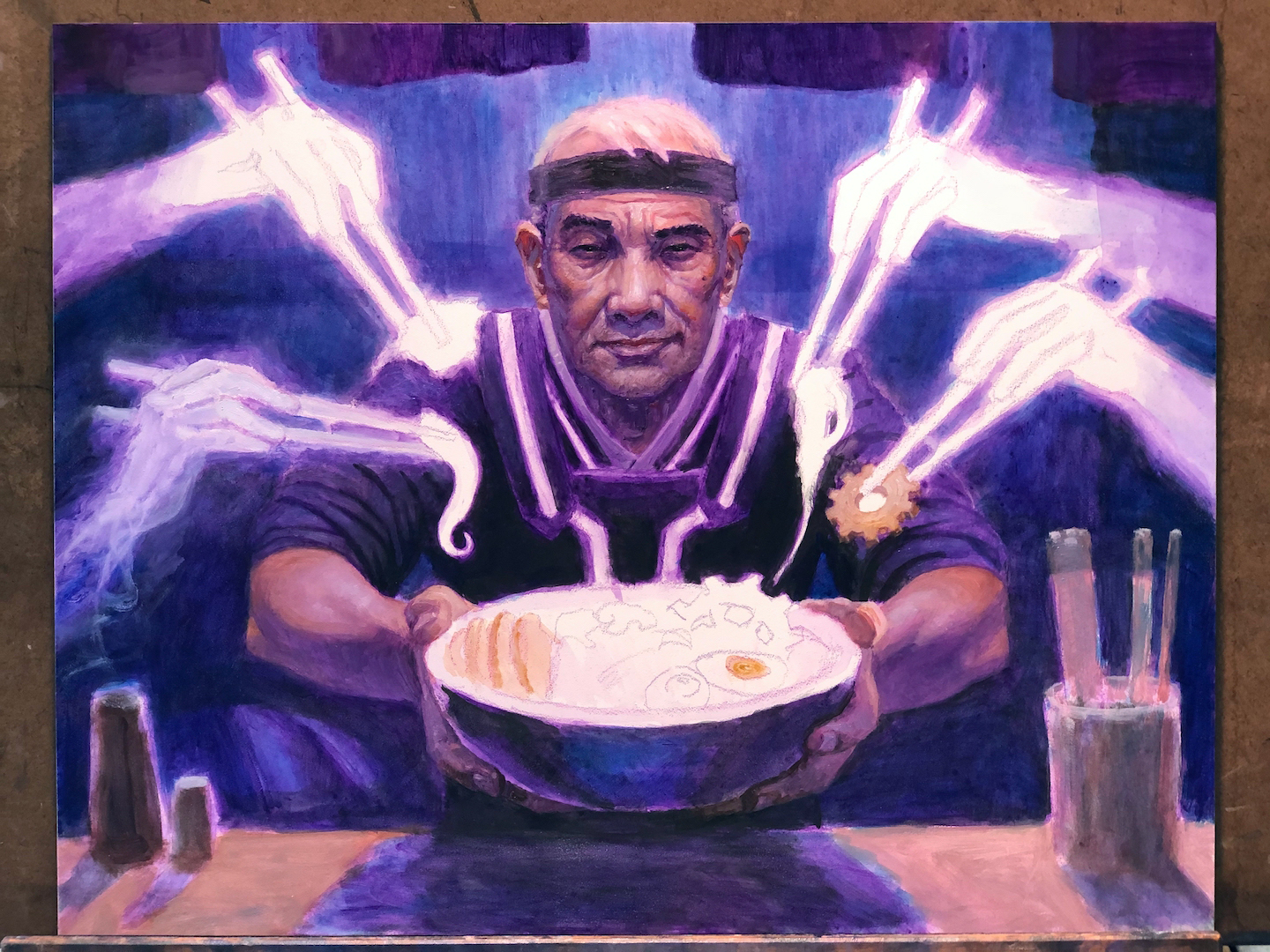 As if on cue, I went and changed the face. Generally speaking, faces are something I’ll often tweak until the very last minute. I had limited time this go around, so I made an effort to get it done early on and leave it (mostly). I also started to dial in on the treatment of the ghost hands (see the bottom left) and the way they were going to trail off into the void. In this case, I started with one to see if I liked it. That way, if I didn’t, I only had to change one and not four.
 Big progress at this point with background and foreground elements starting to take shape, a pass happening on all the spirit hands, another pass on the face and head, and finally a ramen block-in.
I feel like this is a peek into me firing on all cylinders, moving all over the painting, addressing many different things at once. Sometimes I’ll spend a day addressing a single thing, but other days are really just me nailing things down all over the place. I like those days. They fly by.
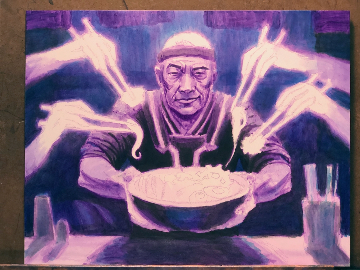
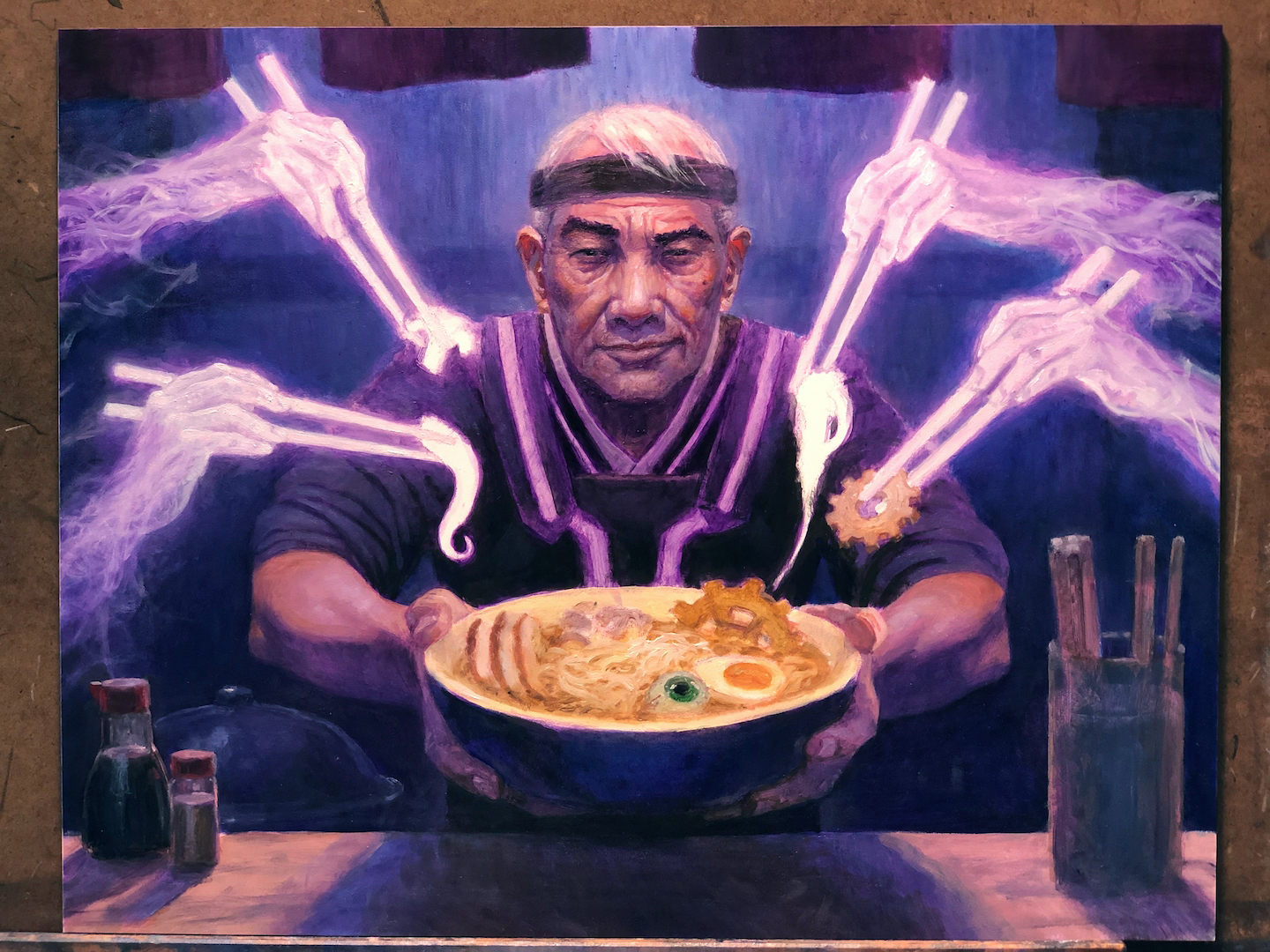
 Really close to landing the plane at this point. You can see I’ve largely completed the figure, the ramen, and the spirit hands. Just a tentacle, a mushroom slice and some ramen noodles to articulate, followed by some push and pull.
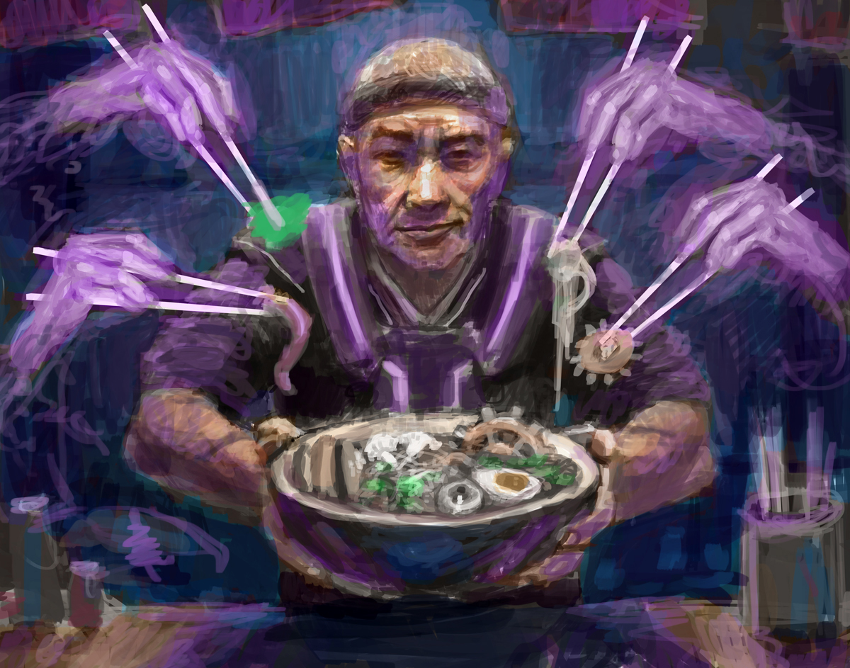
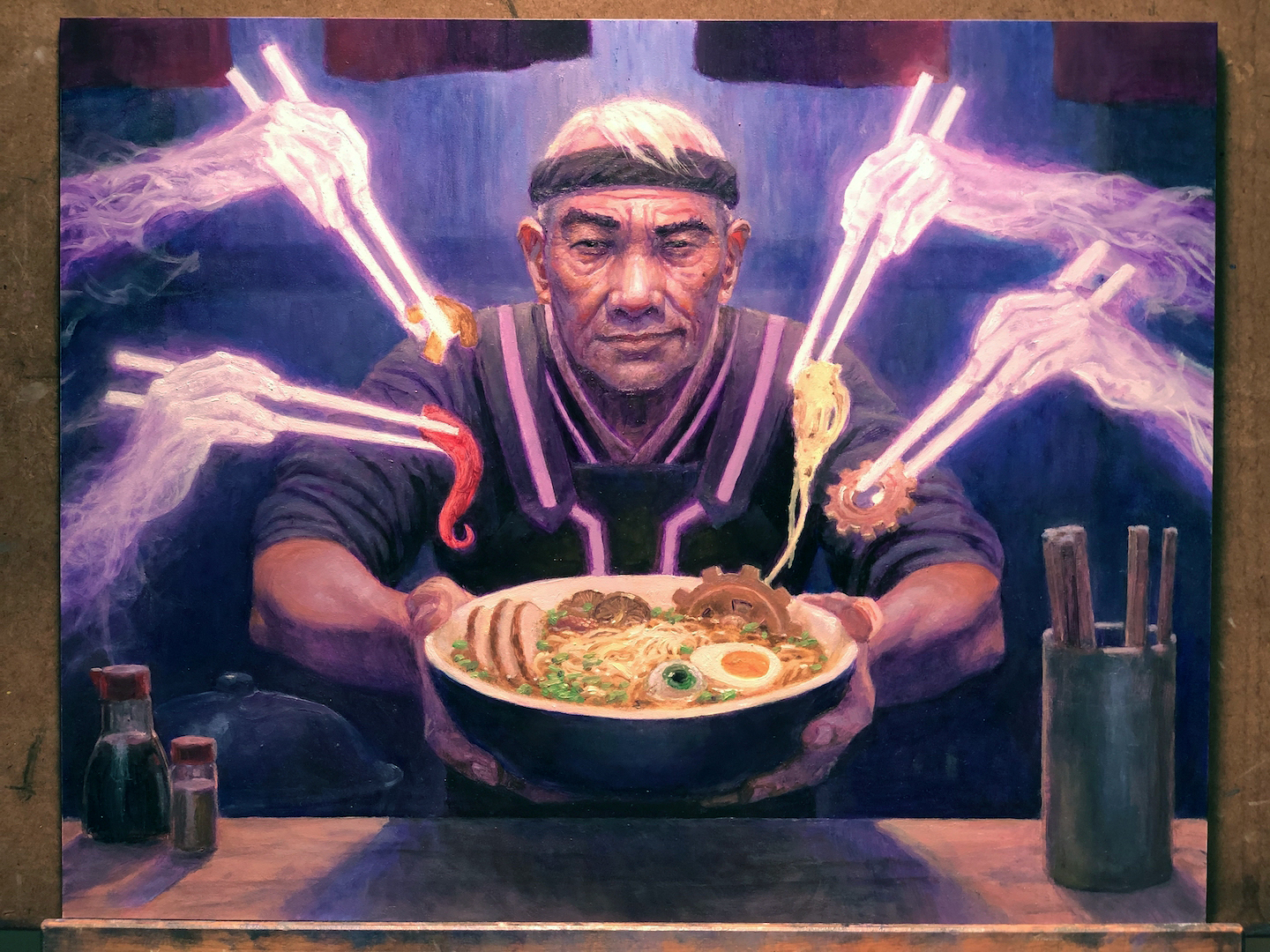
 This is very near complete. I’ve added some elements, and done some glazing to knock back the smoky trail-off of the spirit hands and the glowing stripes on his uniform. I waited until the very end to decide on how far to push those things back and I basically did it all by feel. I was just trying to push things to the point where they weren’t visually interfering with the focal points in any way. My hope is I got them to the point that they were contributing in pulling the eye to where I wanted it to go, and (hopefully) rather than distract the eye and take it anywhere other than that central third of the piece.
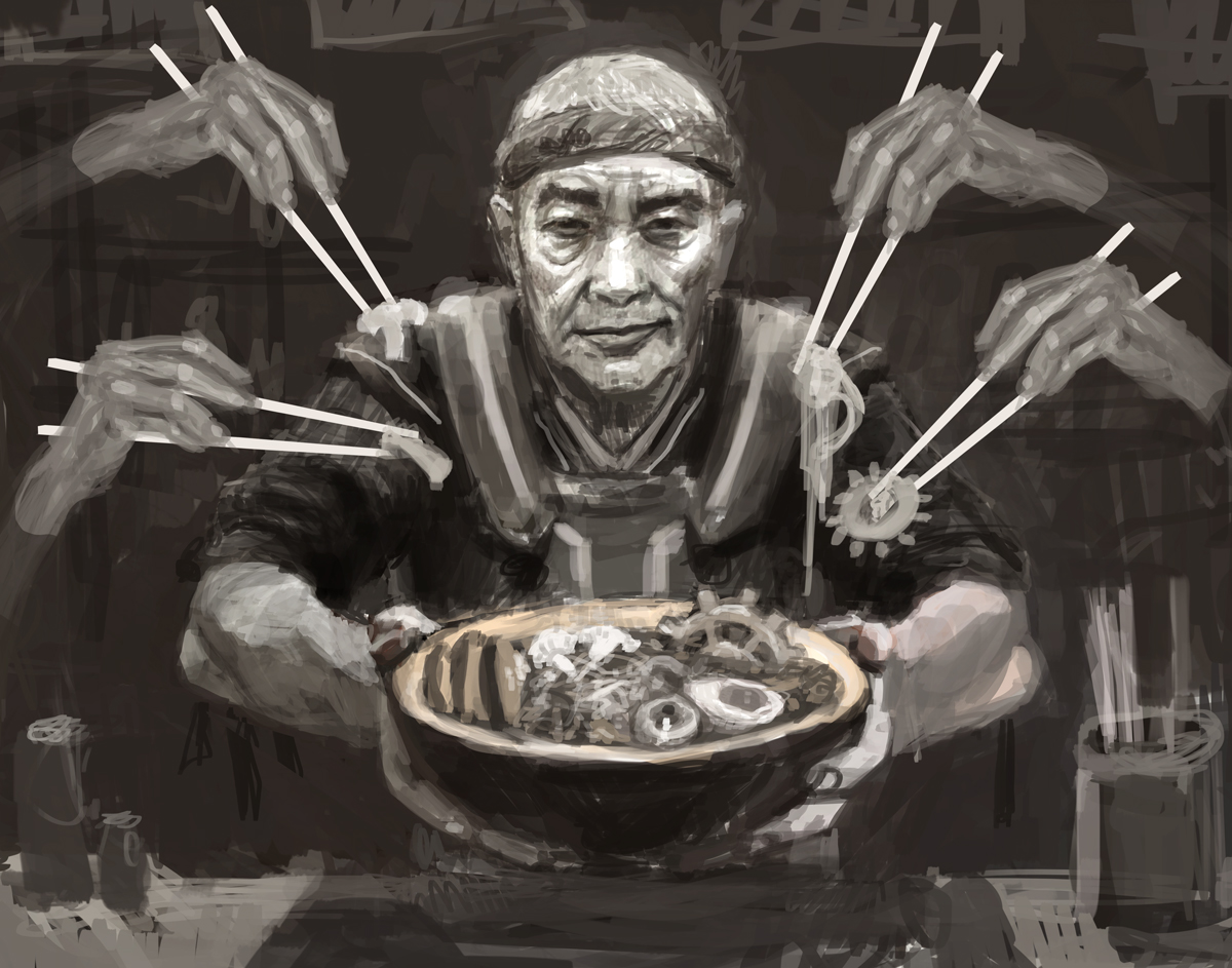
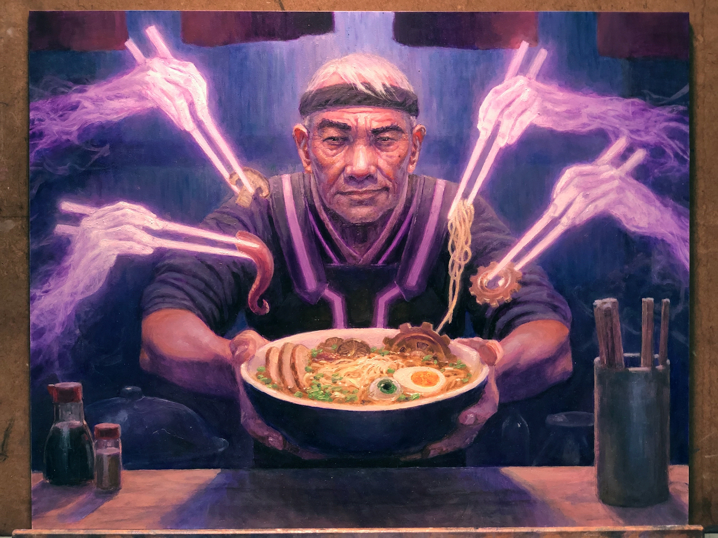
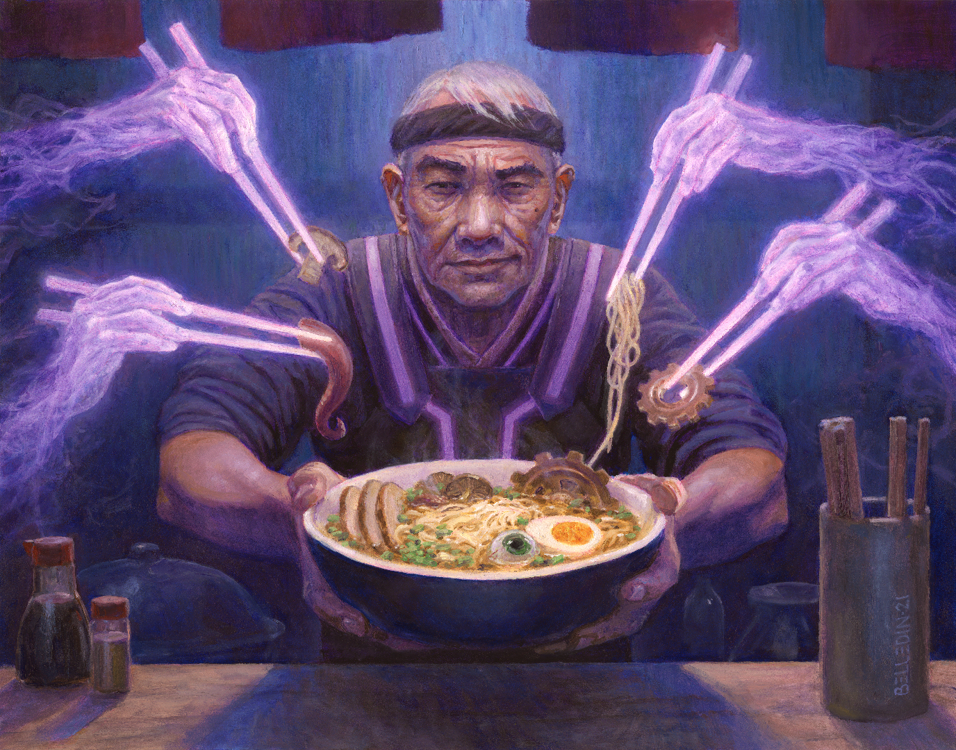 This is the finished piece, which is oil on hardboard. It measures fourteen inches wide by eleven inches tall. Zack Stella was the Art Director. This is how it looks as a card:
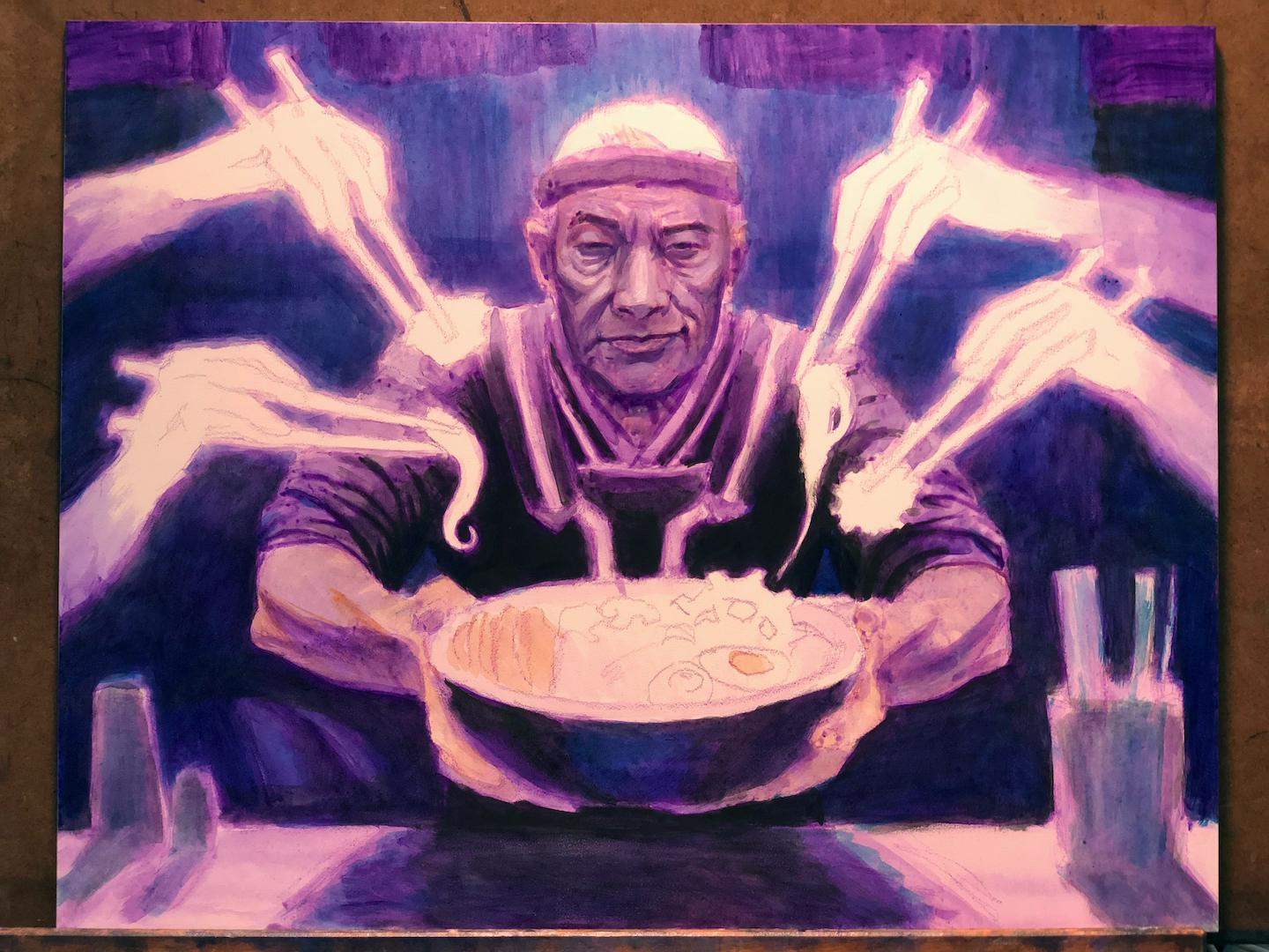
 Keen eyes will note that at the right-hand side of the piece, there’s been a change. Whereas in the painting, there are chopsticks standing in the container at right, they are absent in the card. There is a superstition about upright chopsticks in some cultures, as two upright chopsticks sticking vertically out of a bowl of noodles resembles sticks of incense in a pile of ashes. Understandably, this is considered bad luck. I suspect that Wizards was concerned about the chopsticks as I presented them since they were visually adjacent to that superstition. But honestly I don’t know for sure. Either way, they asked me to change it.
As I pointed out earlier, I did a LOT of research before diving into this piece and my choice to have the chopsticks offered to patrons in such a way was consistent with what I’d seen in much of the reference I’d compiled. What was inconsistent with the reference, however, was the quantity of chopsticks in the container itself. Much of what I saw in my reference were containers jam-packed with chopsticks, so it’s entirely possible that my choice of depicting far fewer of them was problematic in a whole other way. I honestly have no idea.
Whatever Wizards’ reasons for the requested change were, I created two alternate options—one with a container completely full of chopsticks and the version you see in the card above—which I created digitally in Photoshop. Lots of clone stamping, lots of cutting and pasting, and a little bit of digital painting, but fortunately only an hour and a half of effort total.
In the end, I have no complaints. Even if I did, the client is still gonna want what they want. And this was, in the end, a very minor change.
Fortunately, this whole thing—changes and all—came together very quickly, and thank goodness for that. It turned out that this would be the last painting I did while living in Seattle, before moving back to New York State. Literally the day I got final approval on this piece, I began the arduous task of packing my studio and preparing it for a long journey.
Over the years, I have found that certain pieces really stick with me because of what I was going through at the time. This is one such painting. It’s full of mixed feelings, a dose of exhaustion, and a pinch of confusion. That there’s a surreal element to the image is somehow quite appropriate, the spirit hands helping bring things together somehow metaphorical. And in the end, I’m pretty pleased with how it came out and I think it accomplishes pretty much everything I wanted it to do. That’s all I could ever ask for.


Its a beautiful painting Stephen, you should be proud of it!
Brilliant painting. And 4 is the number of death – some people are so creeped out about that they won’t fix 4 items in a serving or stay at #4 in a multi-resident building. There was massive objection when the phone company tried to make a 444 area code here.
I love this painting so much!! Beautiful, interesting, surreal, and just enough of creepiness. That ramen DOES look delicious, LOL! Thank you for such a detailed post about your process. I dream of painting slightly weird MtG paintings just like this some day – definitely prefer a subject like this over dragons and warriors myself 😀